Stephen Liu Design
Ongoing brand identity project for high fashion brand redefining avant-garde with modern individuality.


Crow Icon
Wordmark
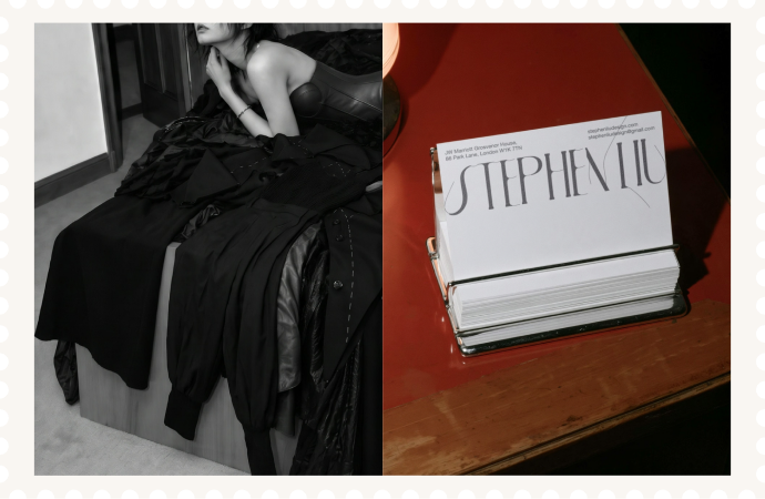
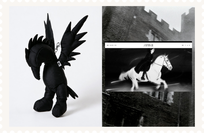
Stephen Liu Design is a visual identity project for an emerging fashion practice, developed to express a brand language that is elegant, raw and quietly defiant.
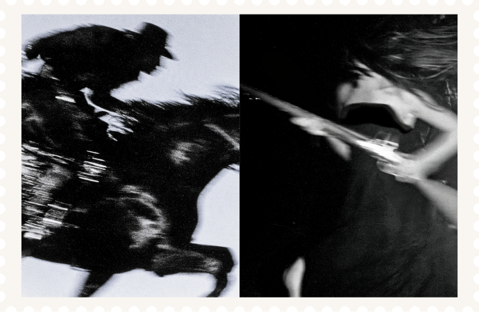
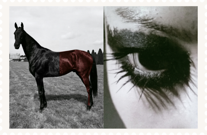
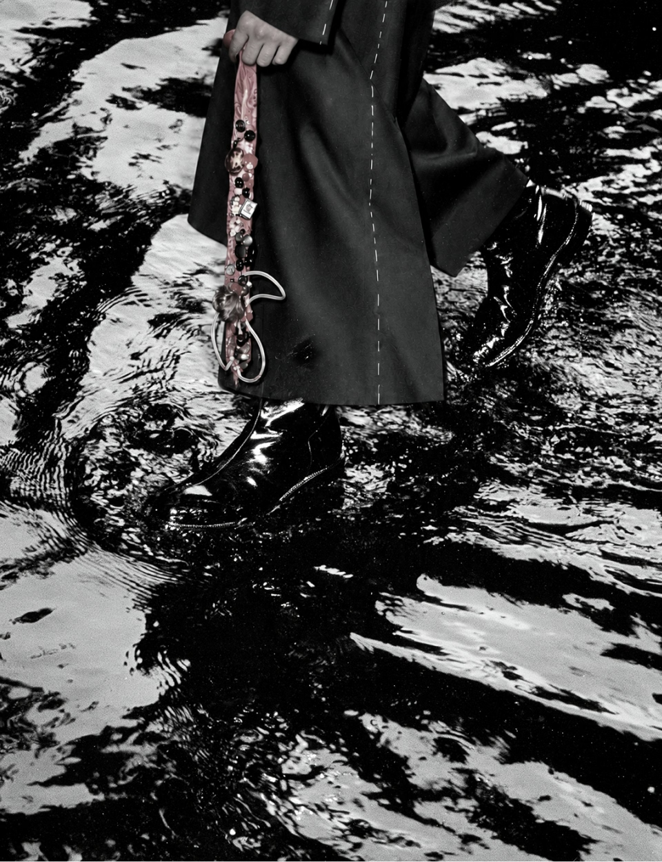
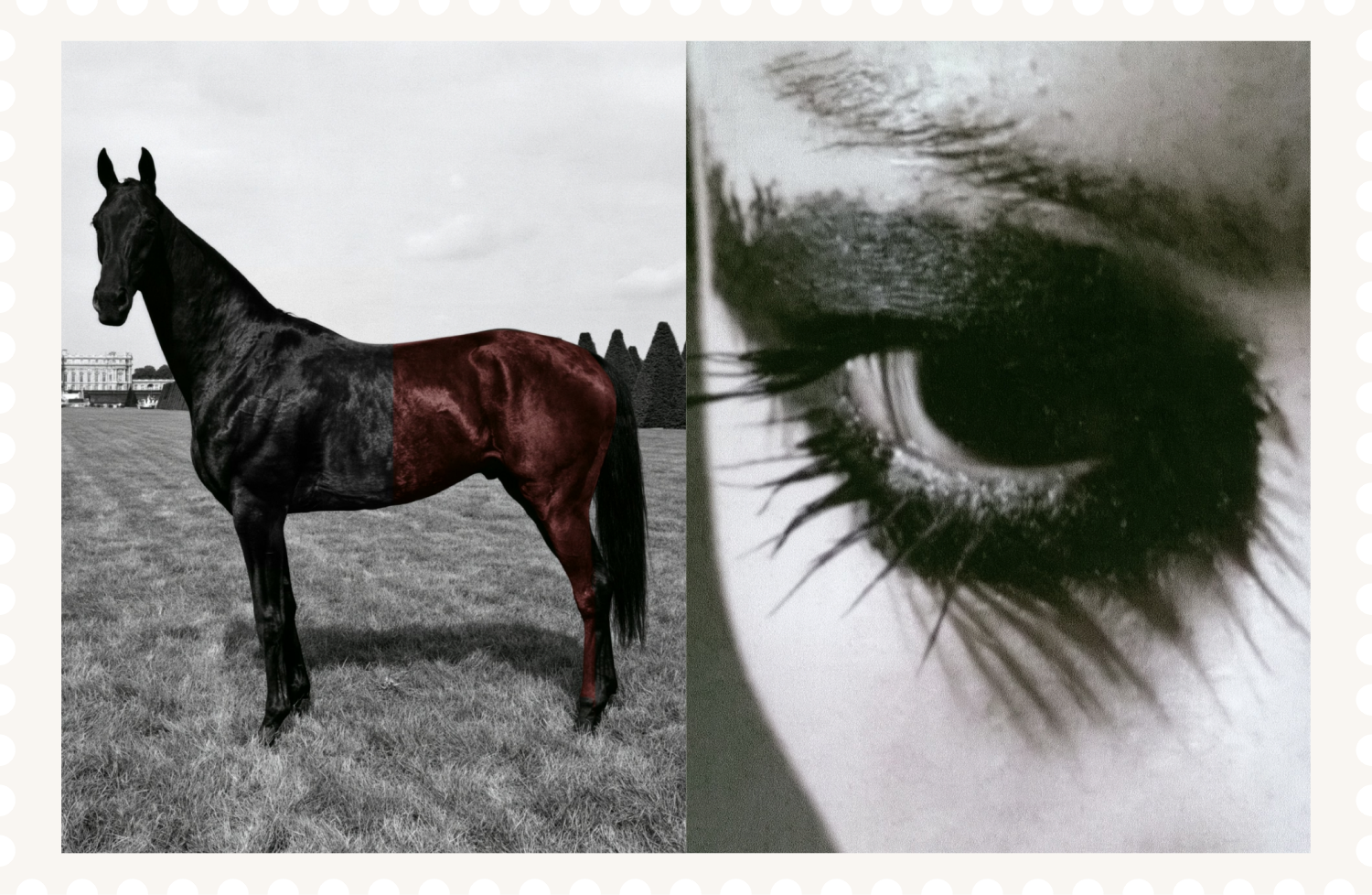
The project began with research into experimental fashion, material construction and visual subcultures, from Issey Miyake, Yohji Yamamoto and Maison Margiela to postwar Japanese photography and contemporary grunge aesthetics. Rather than creating a conventional fashion logo, the identity explores how refinement and instability can exist within the same system.
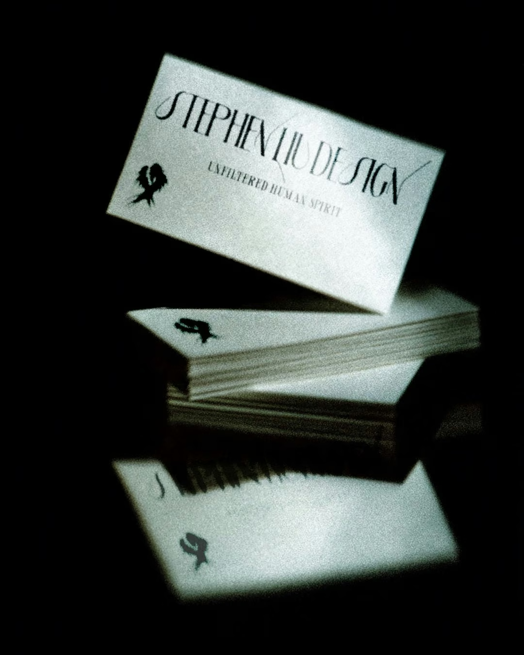
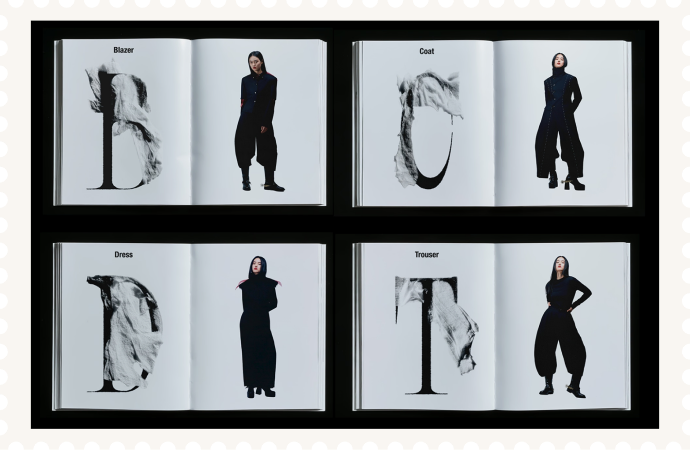
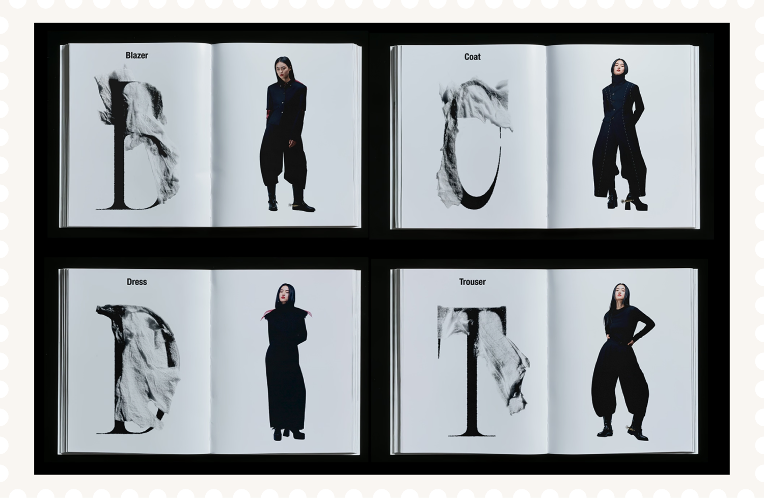
The wordmark combines structured typography with thread-like details that fray, split and soften at the edges. Developed through digital sketches, AI tests, hand observation and real thread studies, the mark brings a tactile, handmade tension into a precise typographic form.
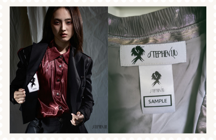
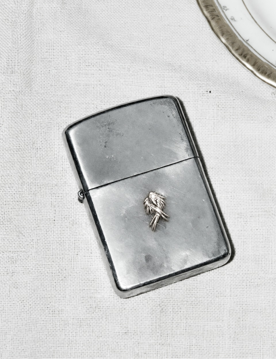
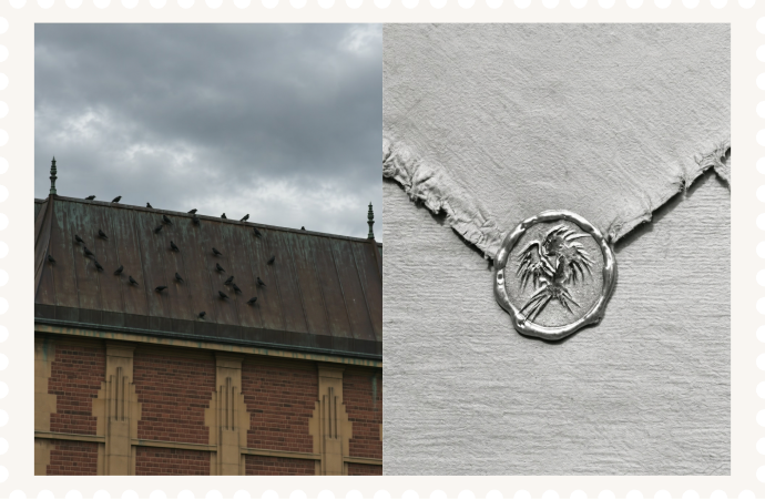
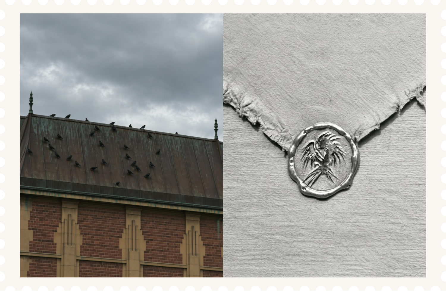
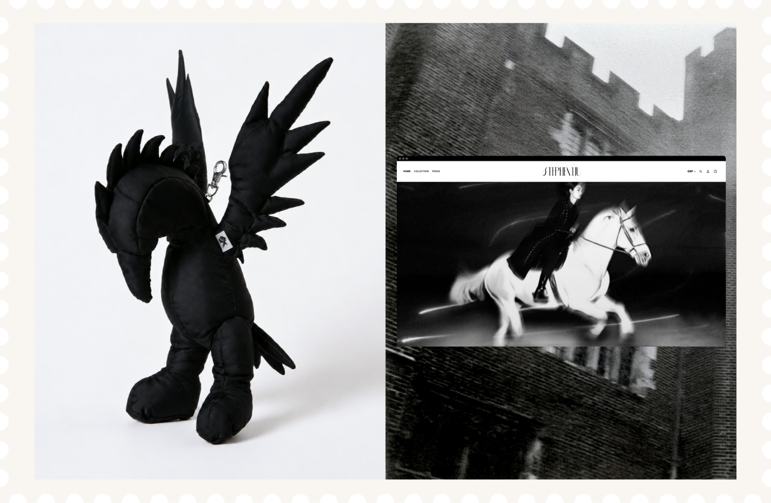
The identity was later extended with a crow-inspired symbol for the “Design” side of the brand. The symbol explores ideas of intelligence, authority and otherworldly beauty, using feather-like forms, fractured texture and a restrained silhouette to create a darker counterpoint to the wordmark.
Together, the system gives Stephen Liu Design a flexible identity that can move across fashion labels, tags, digital applications and motion. It balances high-fashion restraint with raw material expression, creating a visual language that feels delicate, mysterious and deliberately unresolved.
Client
Stephen Liu
Victoria Huerta
Sector
Fashion
Discipline
Brand Identity
Logo Design

Next Project
J.League
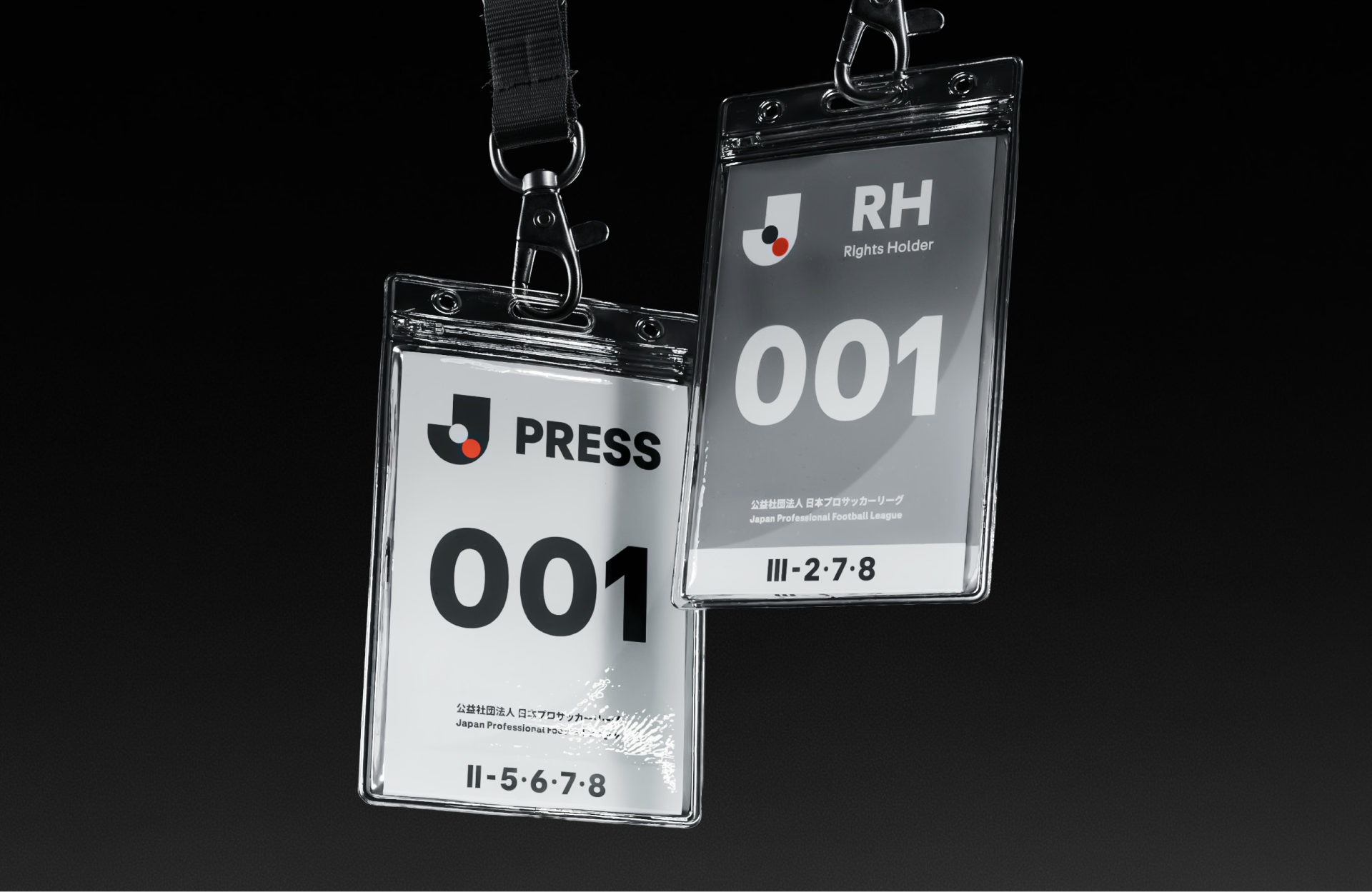
A refreshed J.League visual identity, expressing world-class ambition while celebrating the clubs, communities and supporters at the heart of Japanese football.
Stephen Liu Design
Ongoing brand identity project for high fashion brand redefining avant-garde with modern individuality.


Crow Icon
Wordmark
Stephen Liu Design is a visual identity project for an emerging fashion practice, developed to express a brand language that is elegant, raw and quietly defiant.
The project began with research into experimental fashion, material construction and visual subcultures, from Issey Miyake, Yohji Yamamoto and Maison Margiela to postwar Japanese photography and contemporary grunge aesthetics. Rather than creating a conventional fashion logo, the identity explores how refinement and instability can exist within the same system.
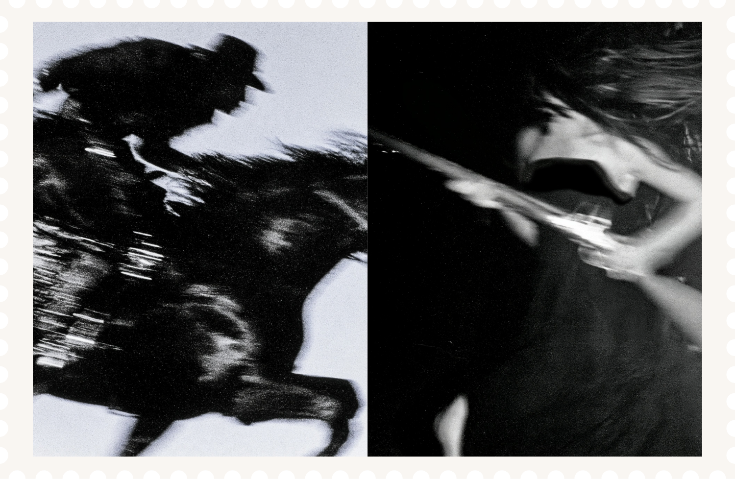
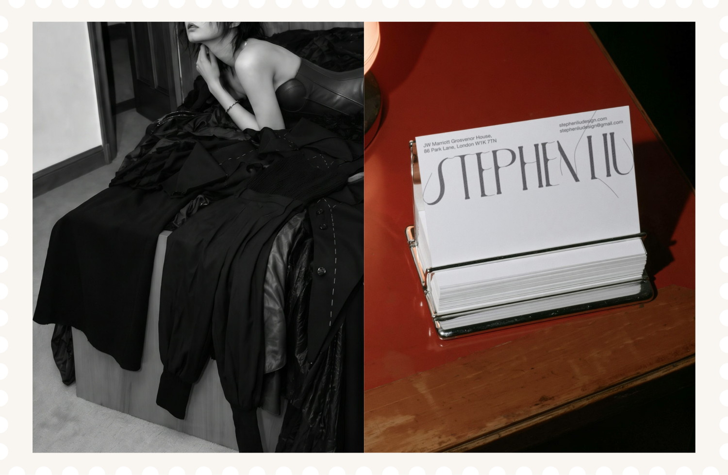
The wordmark combines structured typography with thread-like details that fray, split and soften at the edges. Developed through digital sketches, AI tests, hand observation and real thread studies, the mark brings a tactile, handmade tension into a precise typographic form.
The identity was later extended with a crow-inspired symbol for the “Design” side of the brand. The symbol explores ideas of intelligence, authority and otherworldly beauty, using feather-like forms, fractured texture and a restrained silhouette to create a darker counterpoint to the wordmark.
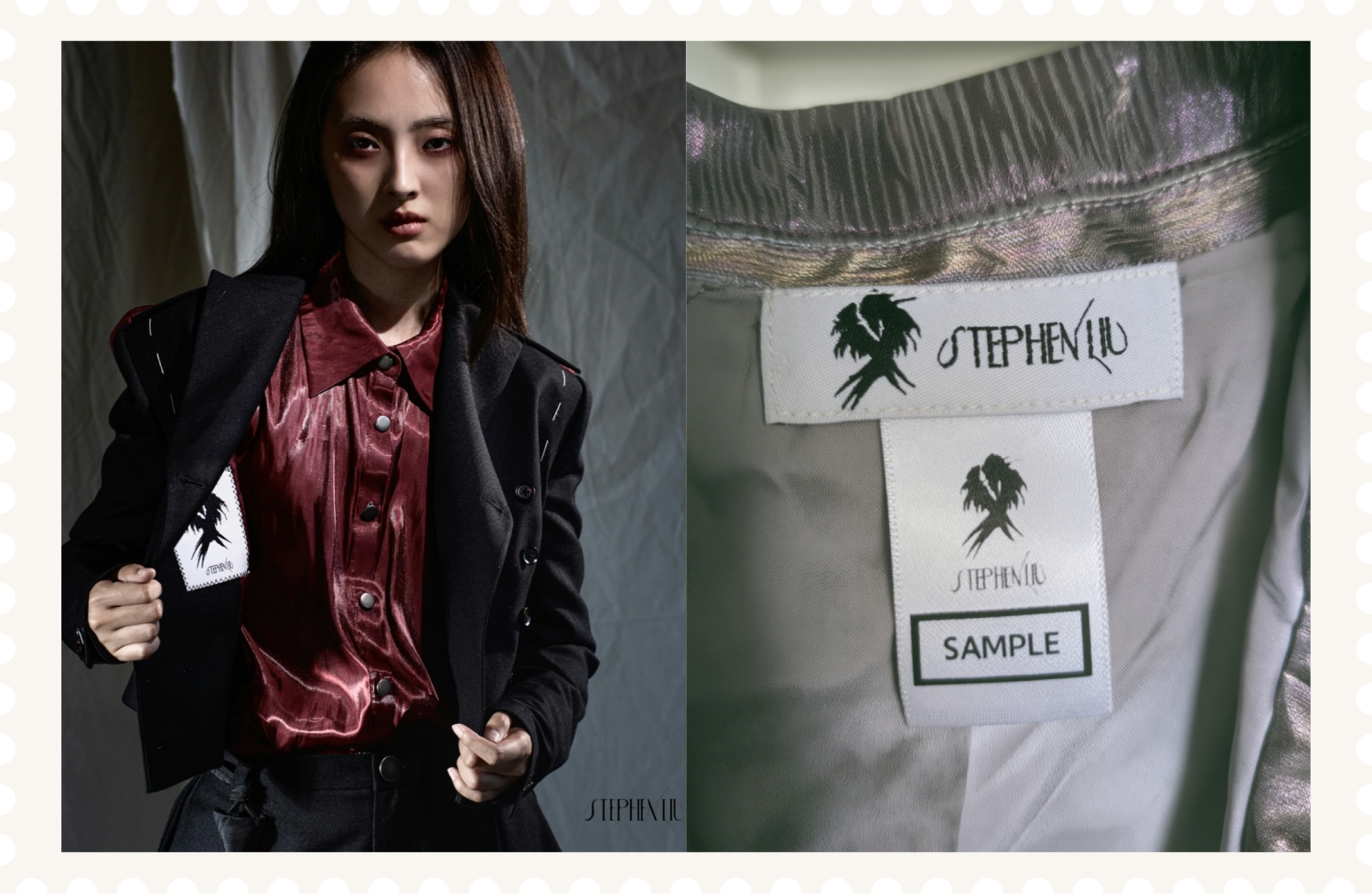
Together, the system gives Stephen Liu Design a flexible identity that can move across fashion labels, tags, digital applications and motion. It balances high-fashion restraint with raw material expression, creating a visual language that feels delicate, mysterious and deliberately unresolved.
Client
Stephen Liu
Victoria Huerta
Sector
Fashion
Discipline
Brand Identity
Logo Design

Next Project
J.League
A refreshed J.League visual identity, expressing world-class ambition while celebrating the clubs, communities and supporters at the heart of Japanese football.

Stephen Liu Design
Ongoing brand identity project for high fashion brand redefining avant-garde with modern individuality.

Crow Icon
Wordmark
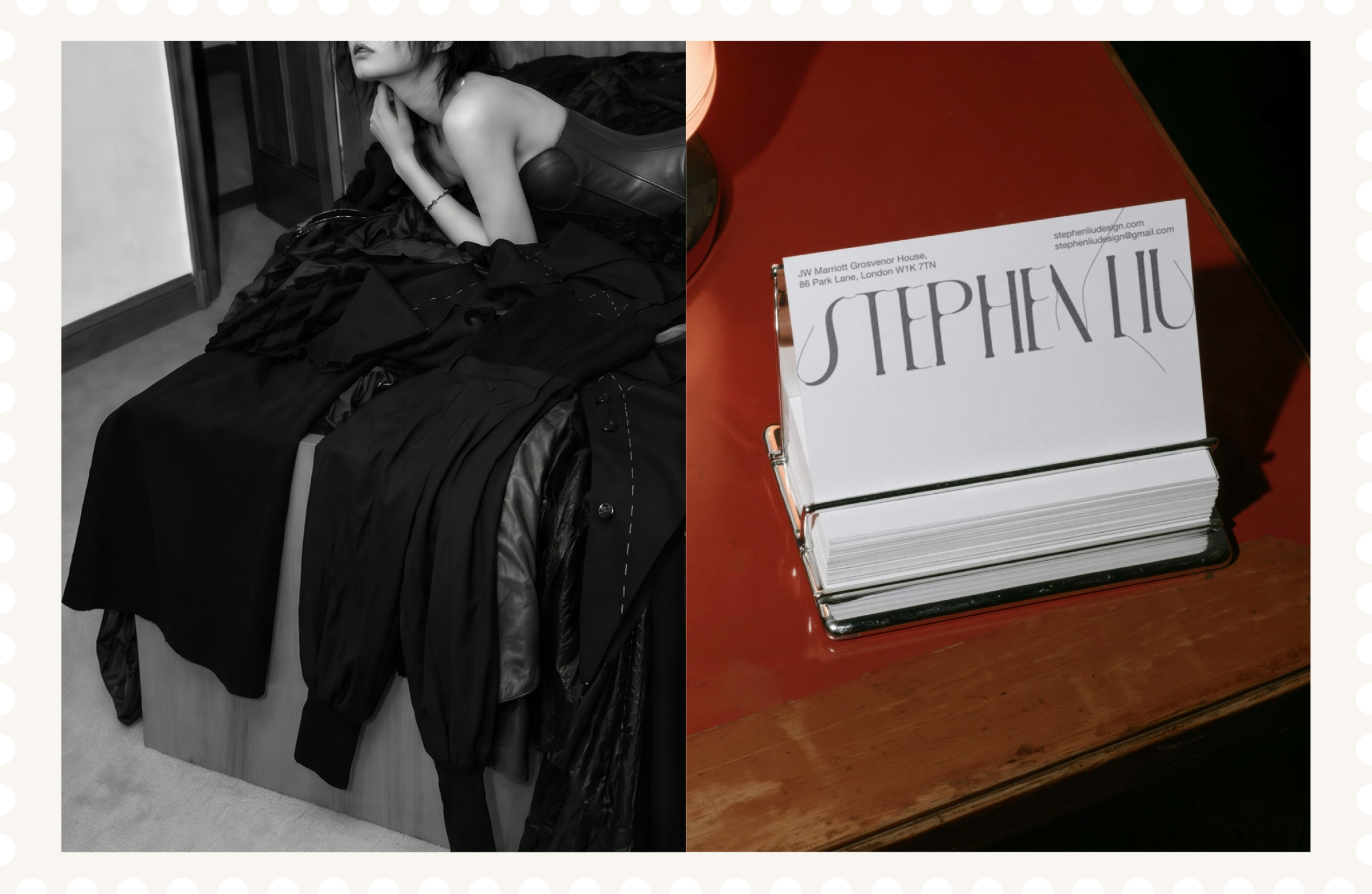
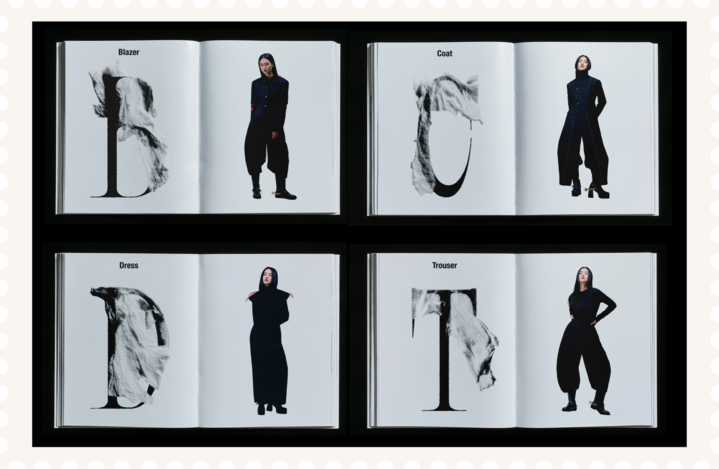
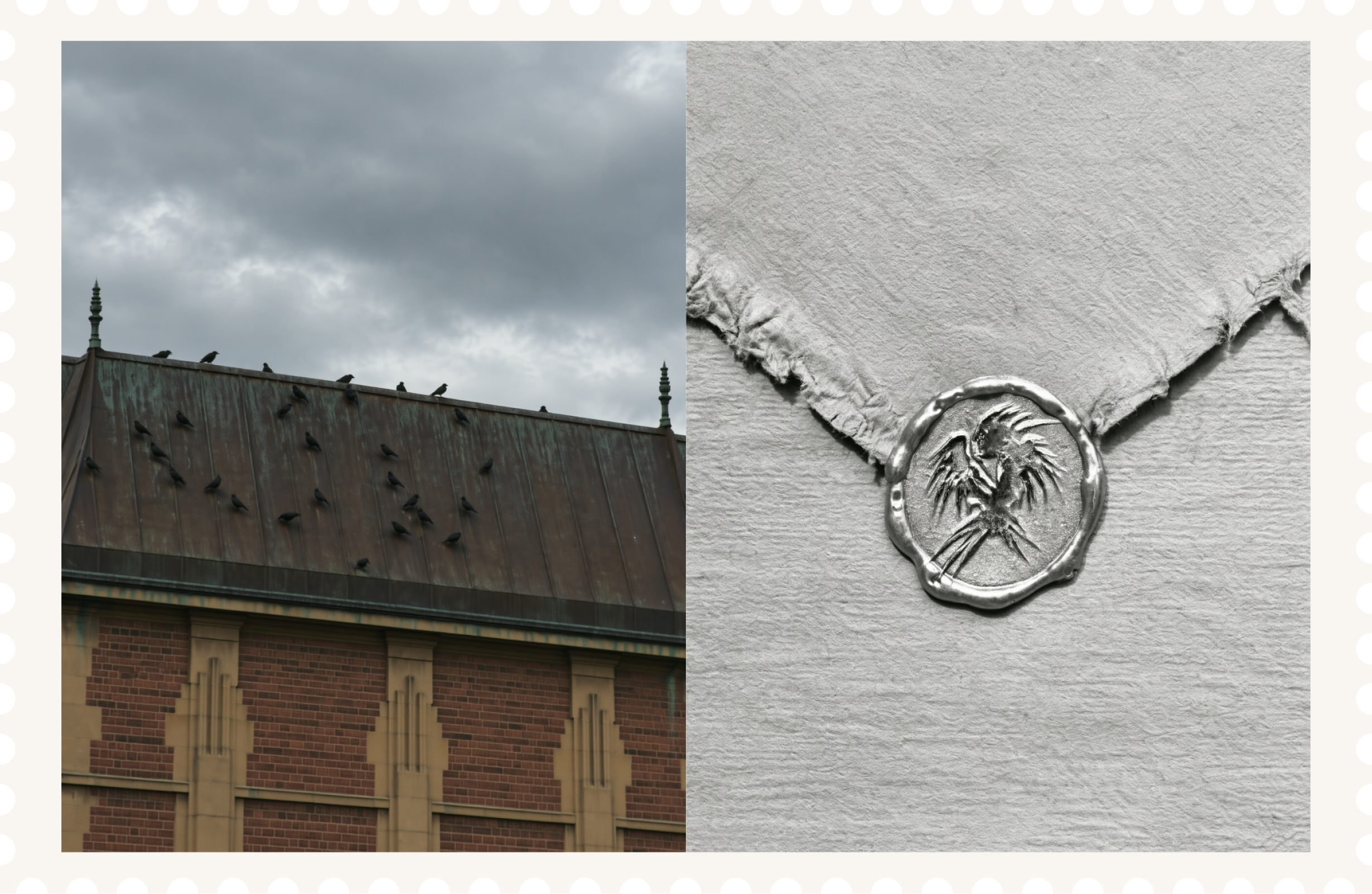
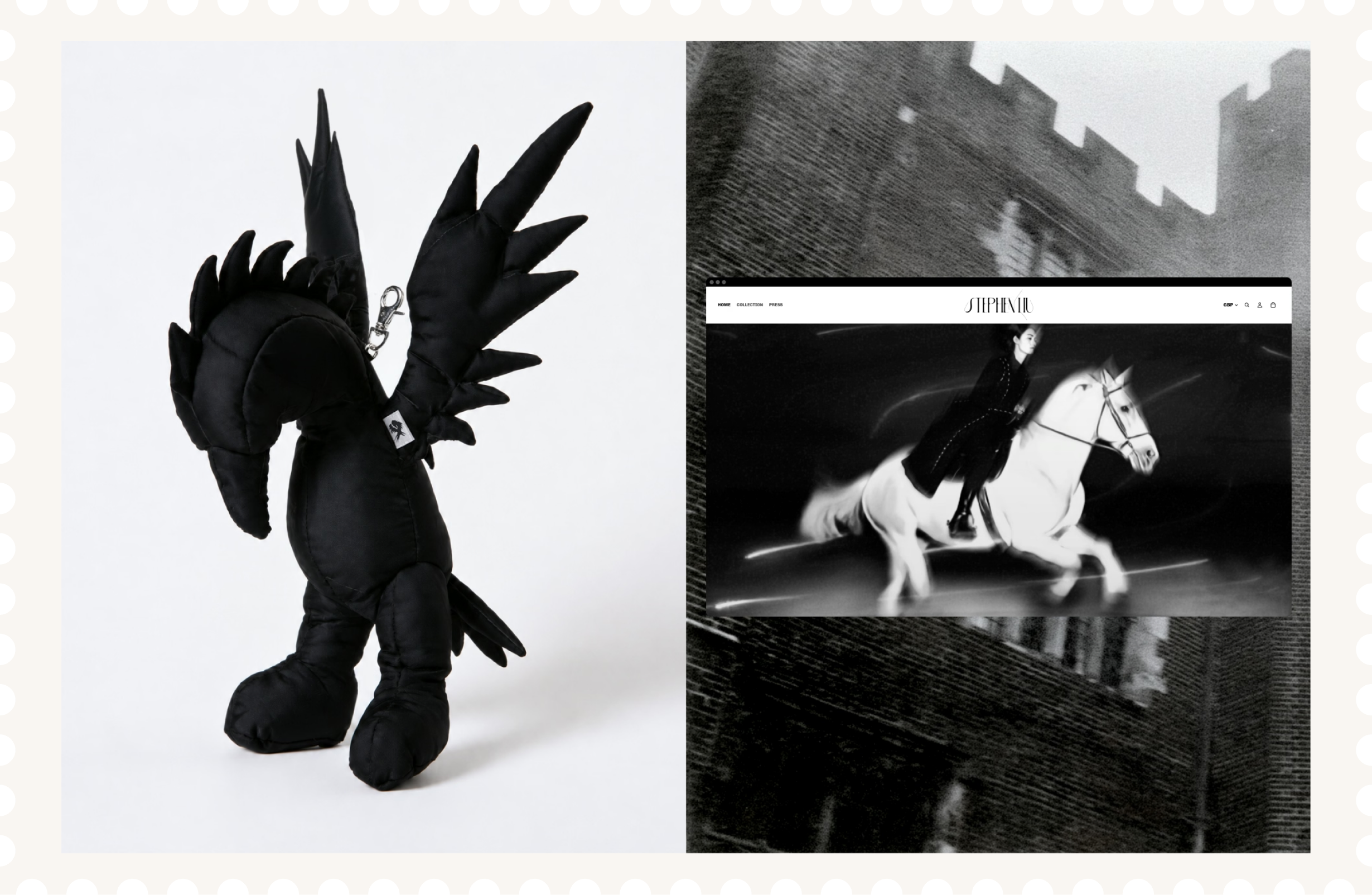
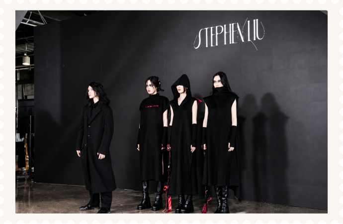
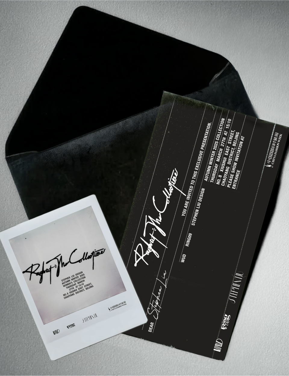
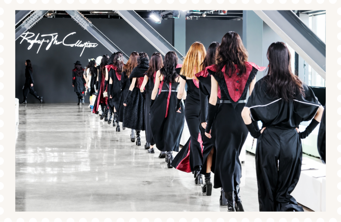
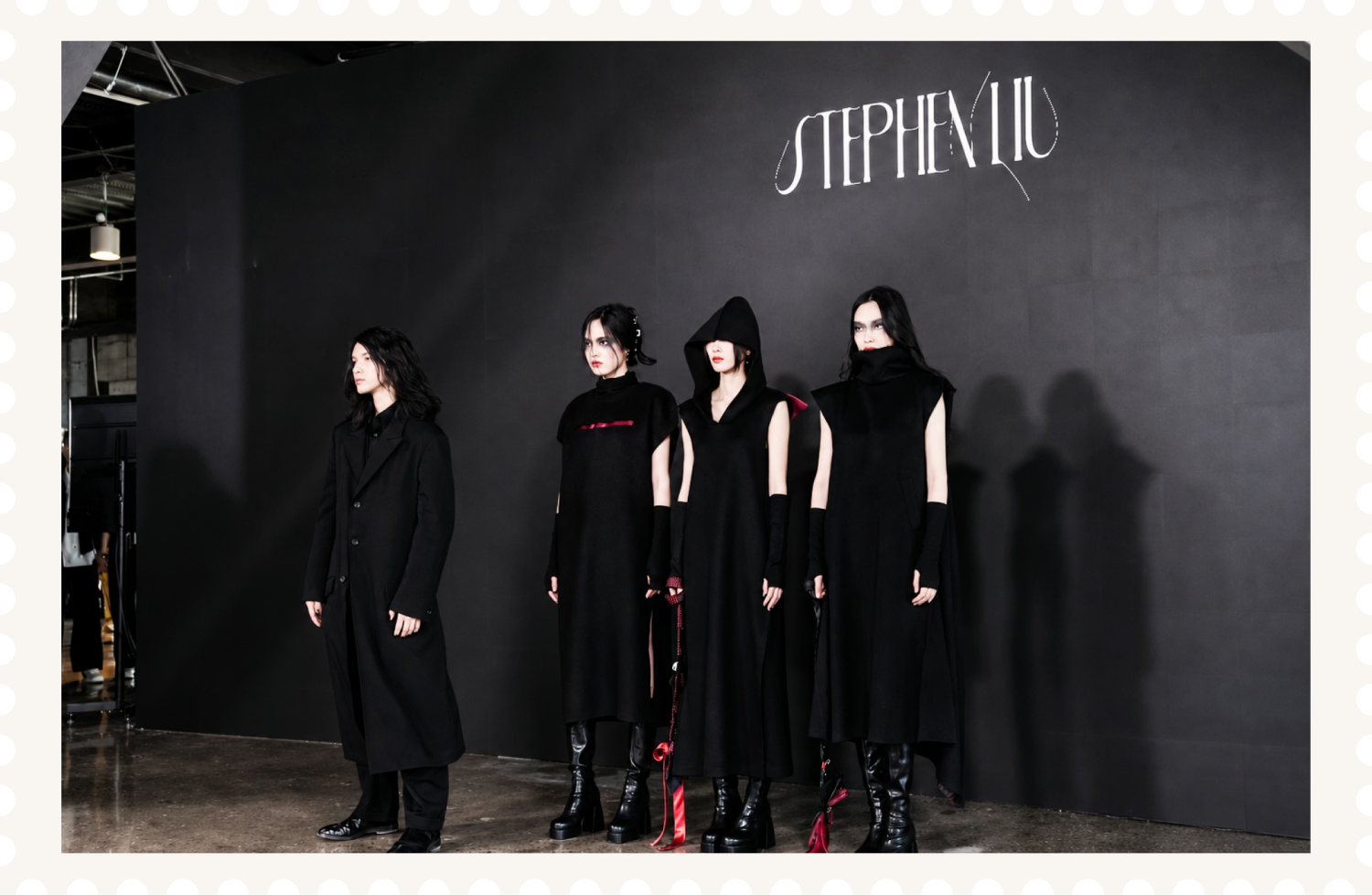
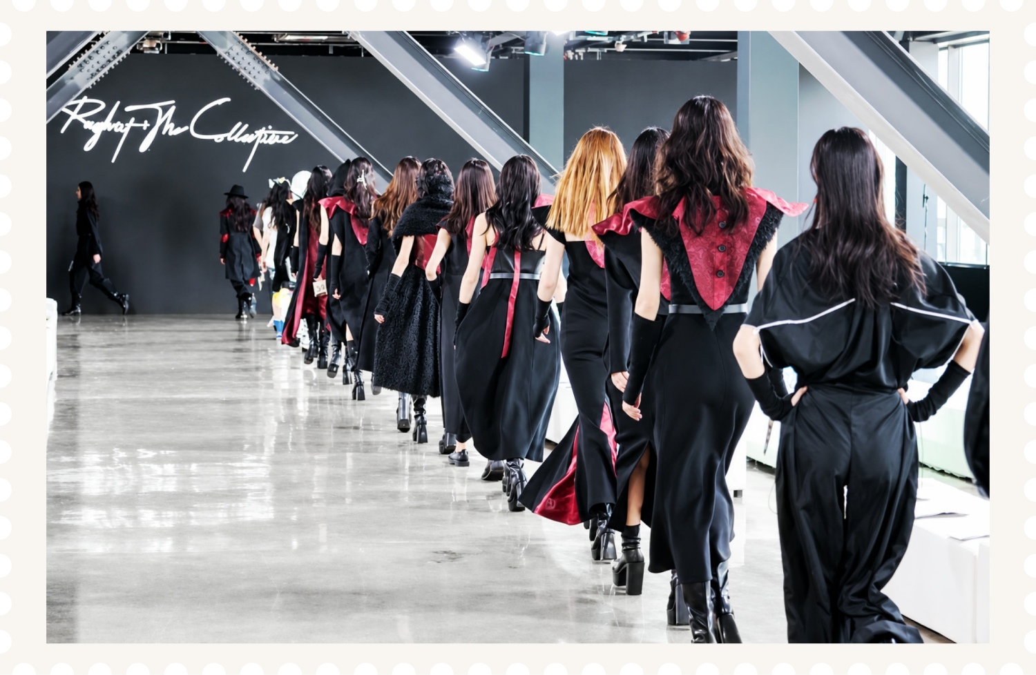
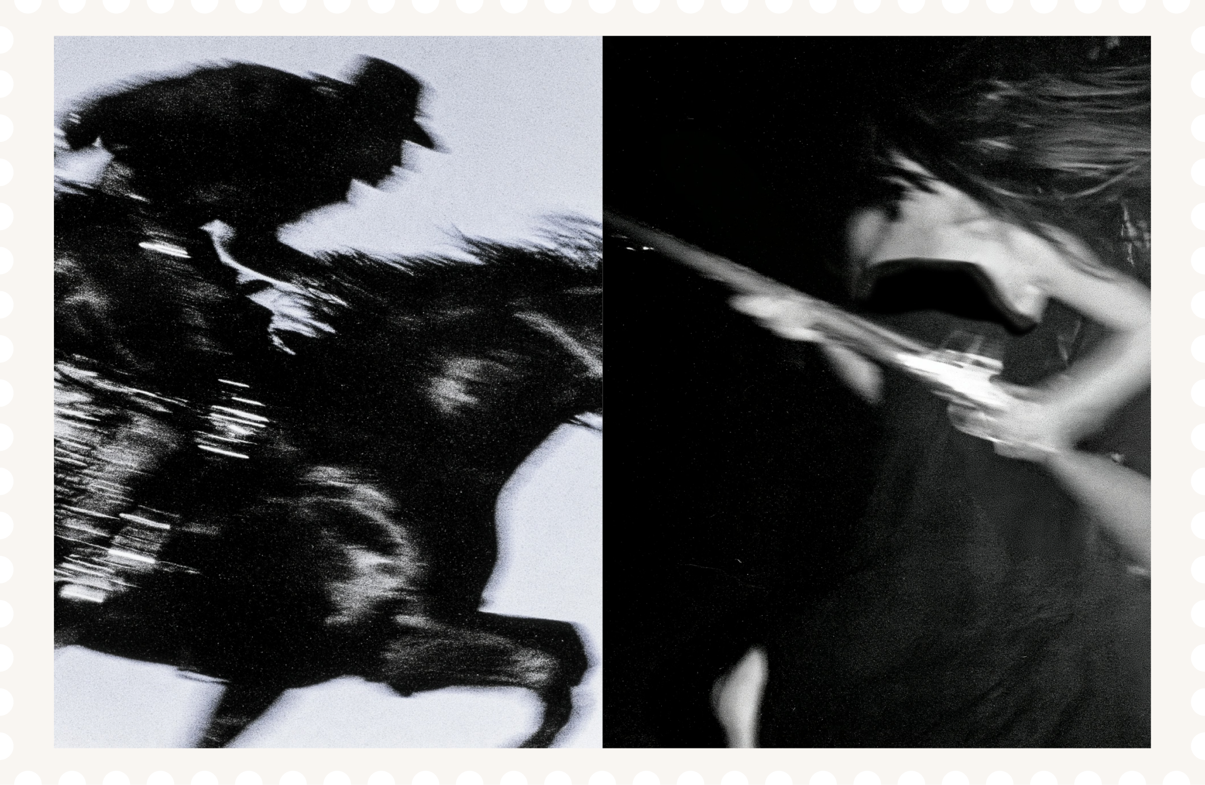
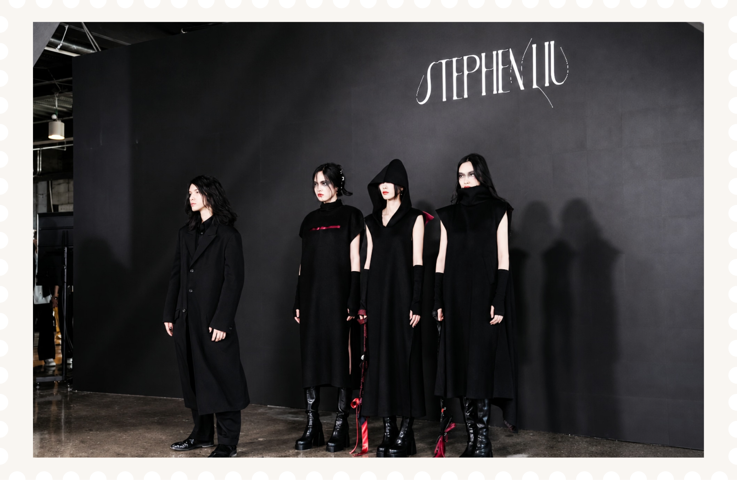
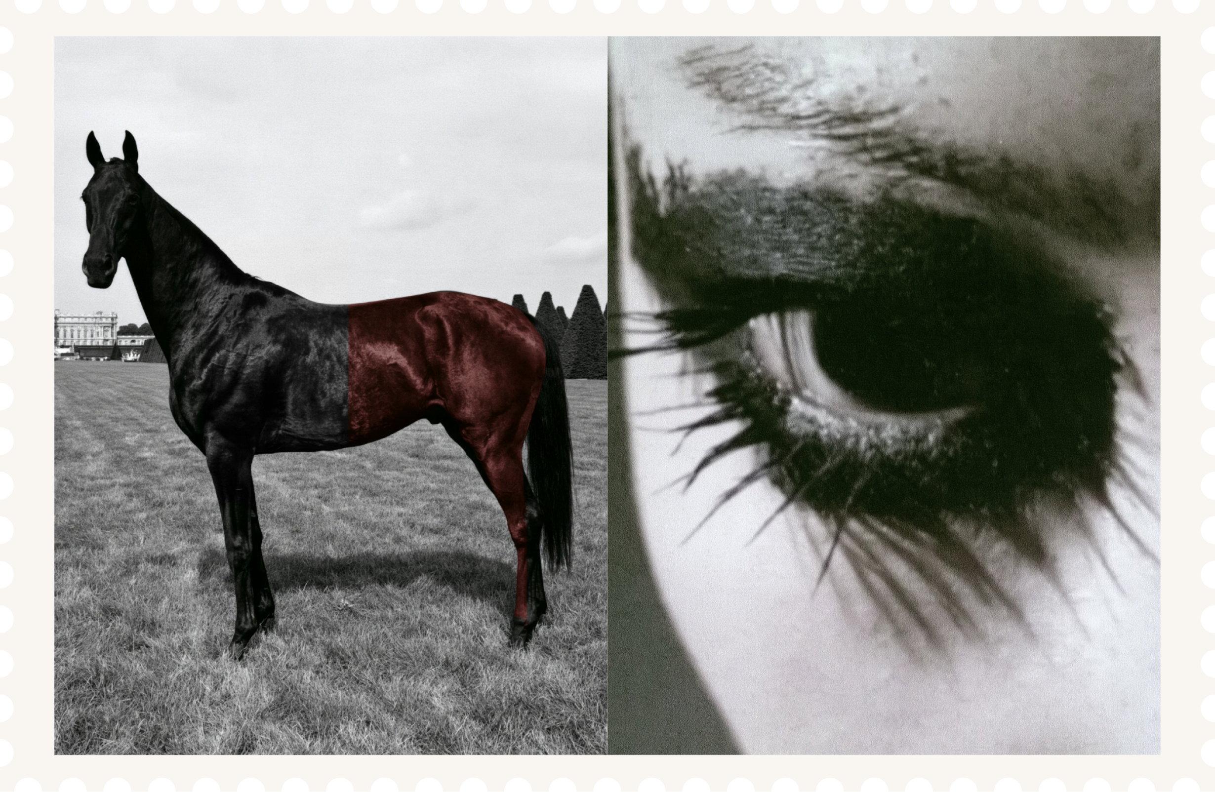
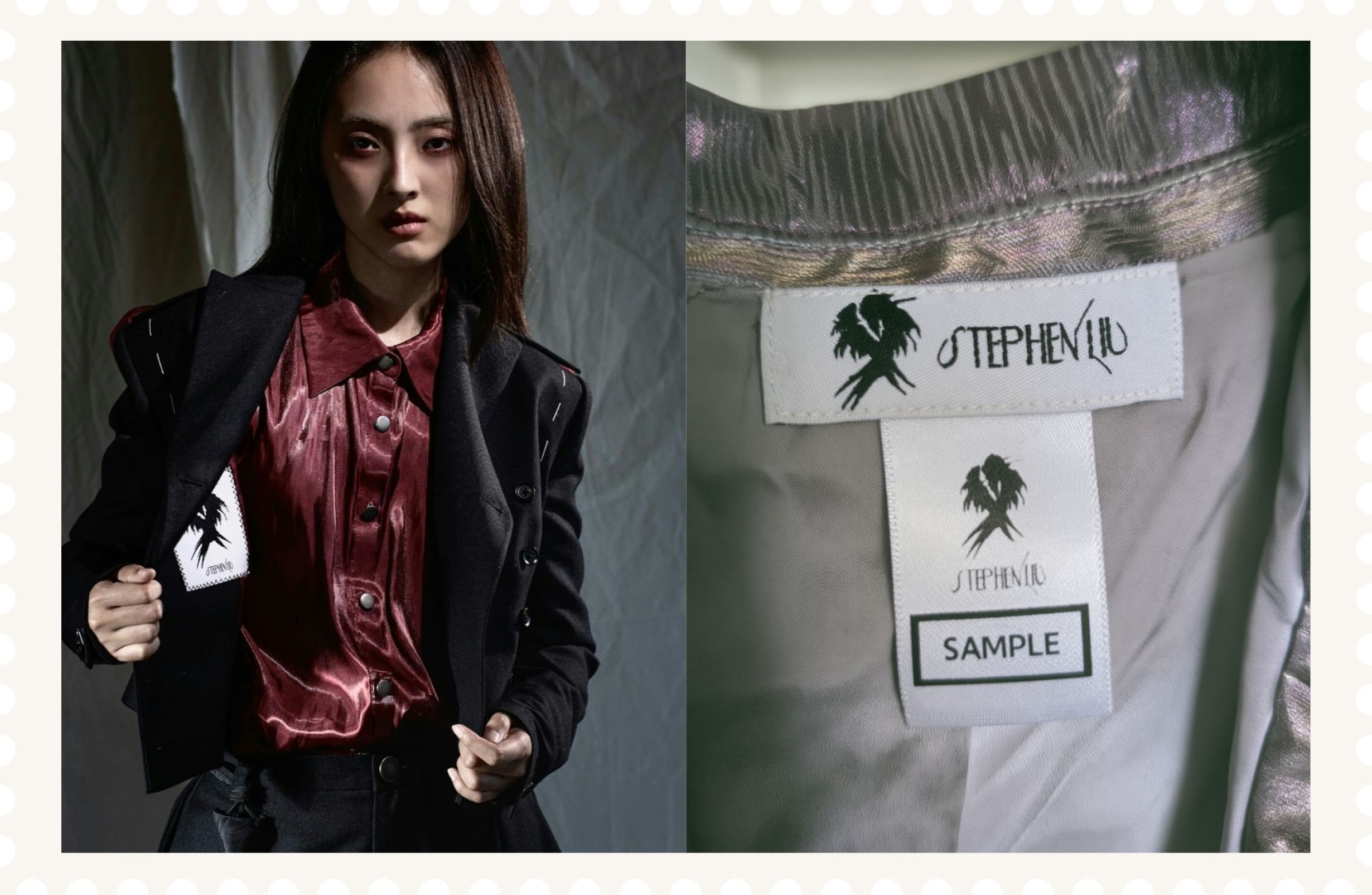
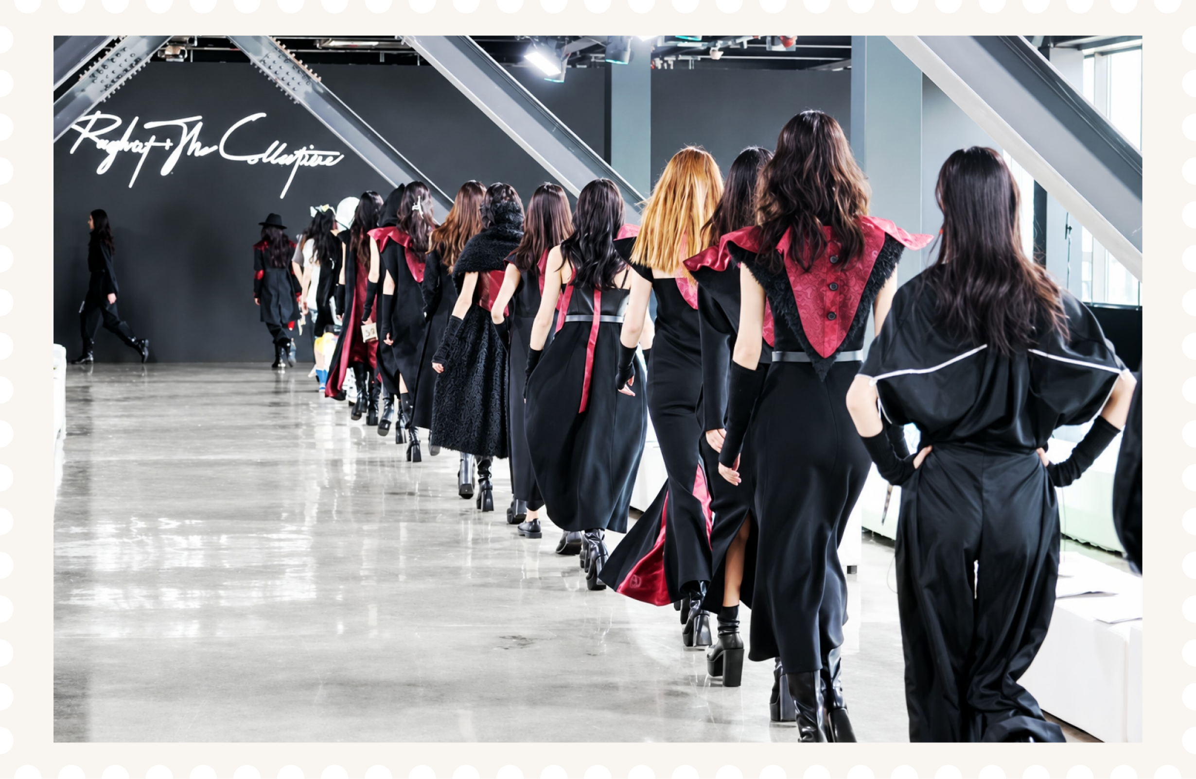
Stephen Liu Design is a London-based fashion label bringing together Eastern philosophy, European tailoring and an avant-garde approach to construction. I designed its wordmark and crow symbol, followed by show graphics and an AI-generated film, translating the label’s independent spirit into a visual identity. The wordmark uses Fleck for its elegance, fragility and youthful, experimental character, reflecting clothing that draws on Art Deco, 1930s silhouettes and Japanese fashion while looking towards the future. Working through sketches, AI experiments and physical thread studies, I extended the letterforms into loose, illustrative strokes inspired by threads exposed on the inside of a garment. These irregular lines carry the label’s approach to deconstruction into typography.For the crow symbol I looked at thousands of AI-generated versions. I carefully chose the bird’s position, the shape and how it was put together to show being alone and being self-reliant. Its expressive form brings the identity closer to illustration, allowing it to move beyond the geometry of a conventional logo.For the label’s debut at Rough Cut Collective, I designed the show logo and invitation. The lettering drew on handwritten annotations found on period photographs, connecting with the show’s 1930s setting through repeated sketching and AI-assisted experimentation.The work also included an AI-generated film, for Shenzhen Fashion Week 2026. Across all these projects AI was a way to expand ideas. This matched the label’s desire to challenge ways of doing things.
Client
Stephen Liu
Victoria Huerta
Sector
Fashion
Discipline
Brand Identity
Logo Design
Video Production
AI Creative Direction

Next Project
J.League
A refreshed J.League visual identity, expressing world-class ambition while celebrating the clubs, communities and supporters at the heart of Japanese football.
