Monraku
Conceptual Japanese brand identity and AI ring for post-COVID senior care.

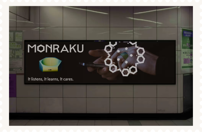


Pick up what you love. Again.
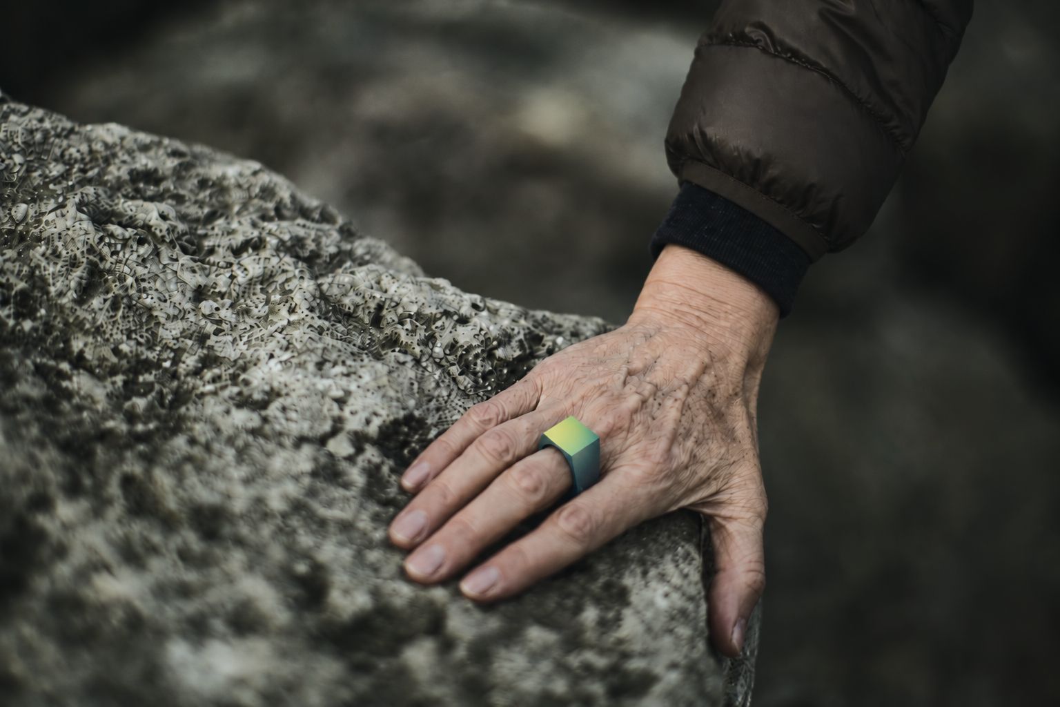
Find more reasons to
step outside.
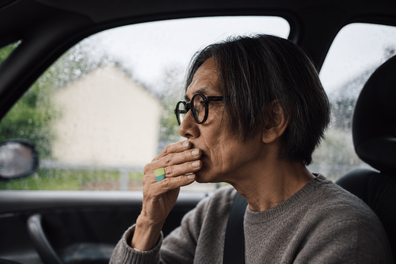
Share what makes you,
you.
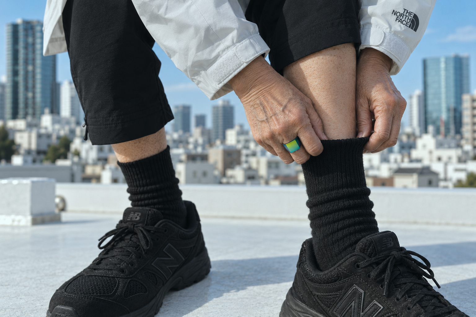
Move more.
Enjoy more.

Make room for new
connections.
Discover what’s next for you.
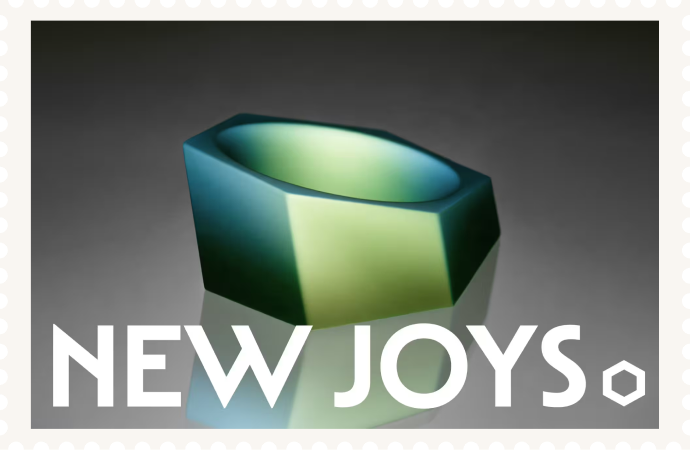
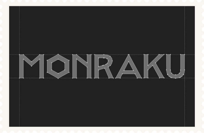
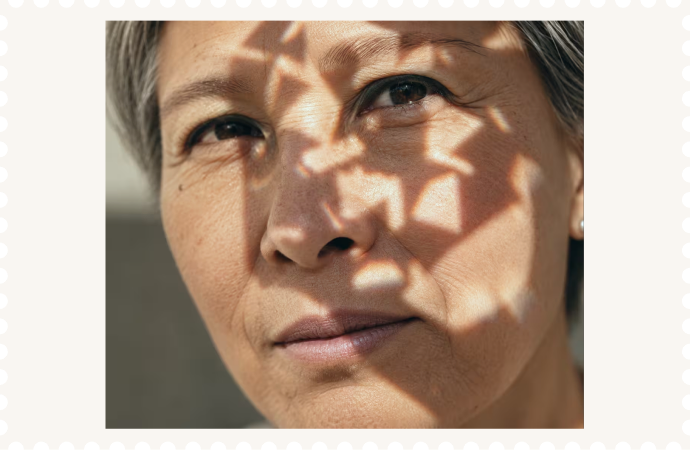
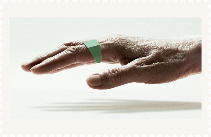
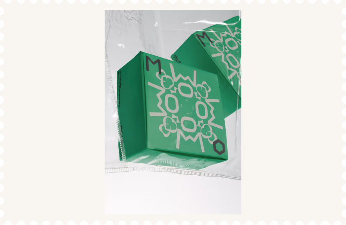
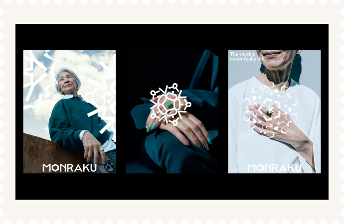
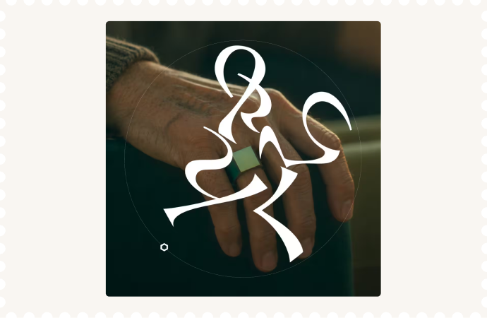
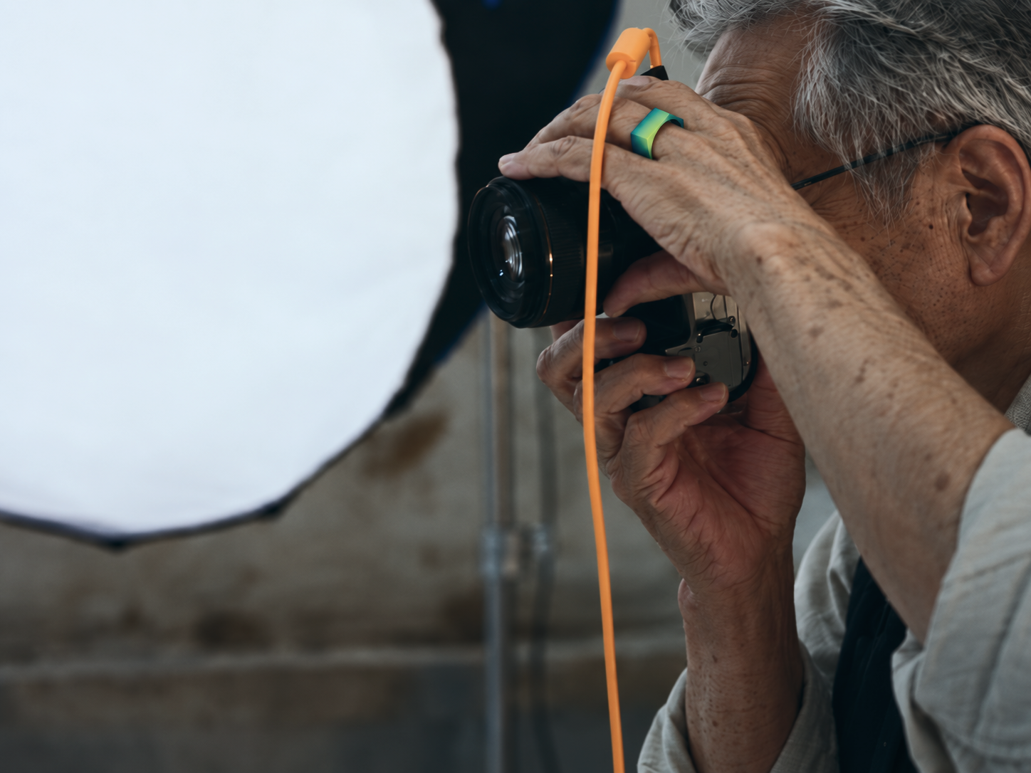
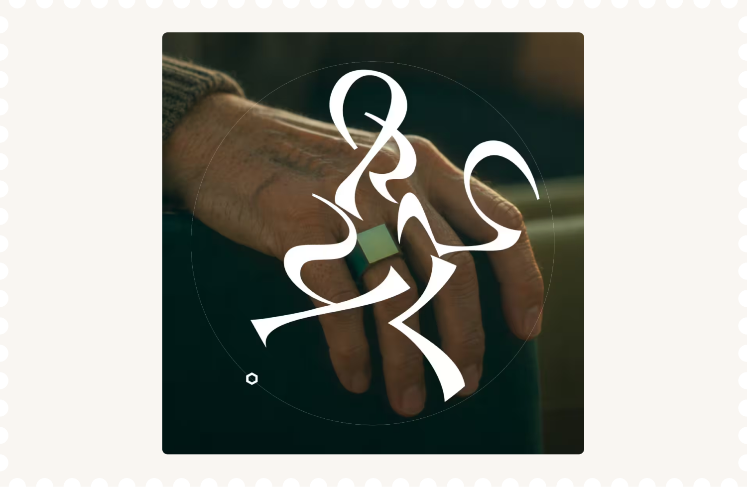
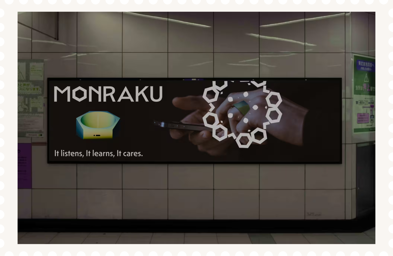
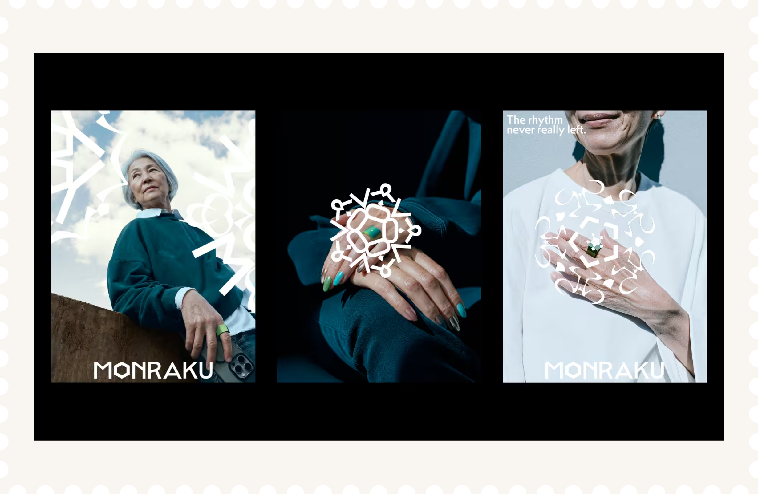
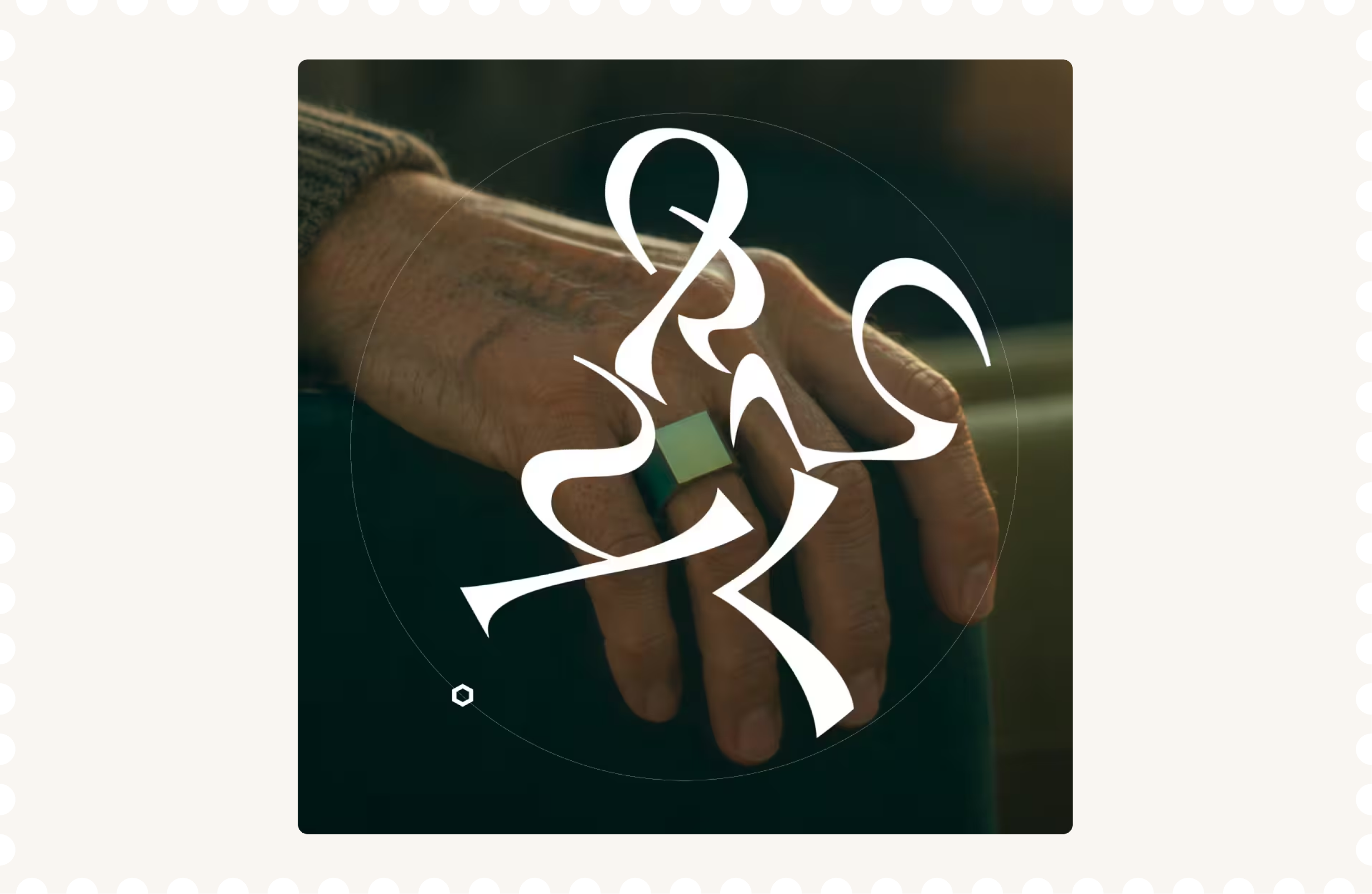
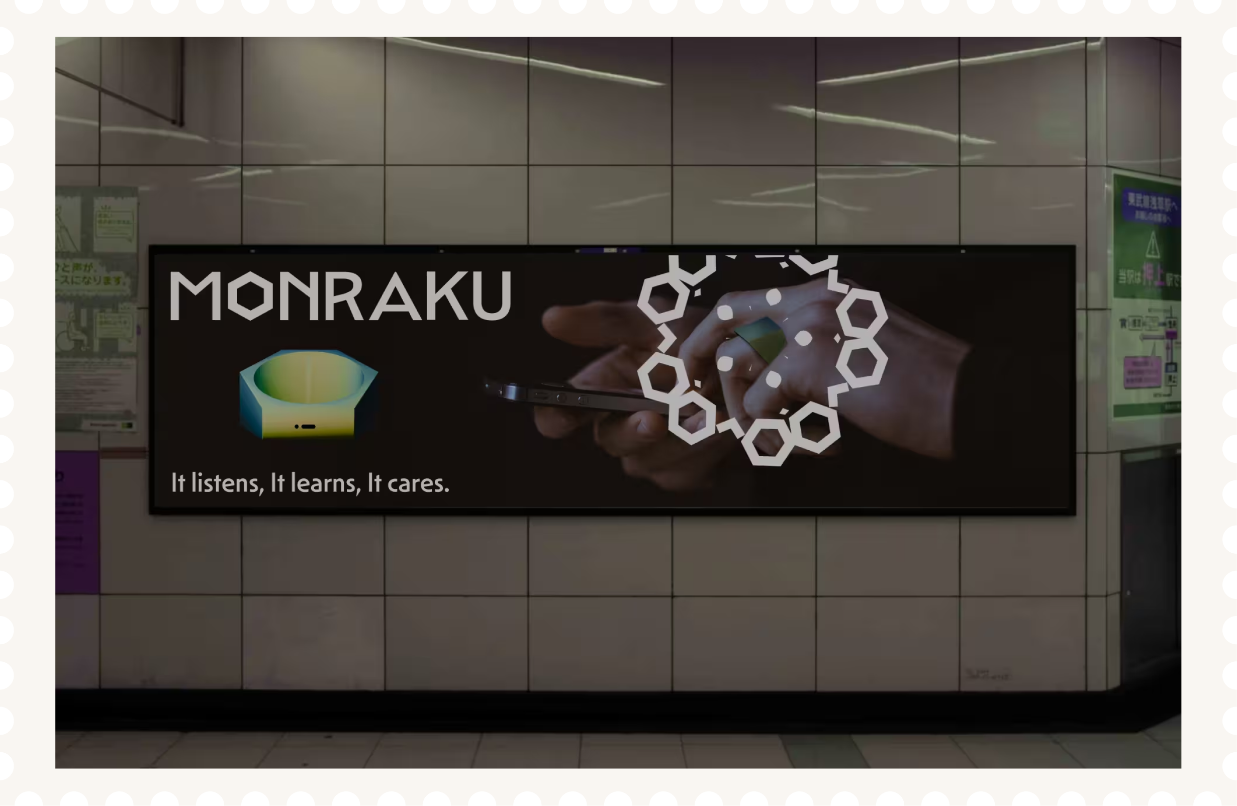
Monraku is a brand identity for an AI ring that helps older adults return to old hobbies, try something new and reconnect with people. Designed as a personal companion they can take anywhere, it encourages them to get out, follow their interests and feel like themselves again. The name plays on dorakumono, a Japanese old slang of indulging in leisure. Here, being absorbed in what you love becomes something to celebrate in later life. The ring takes its shape from diagonally cut bamboo, with a reference to The Tale of the Bamboo Cutter and the idea of a new beginning.The design centres on energy. The greens come from young leaves and new shoots, chosen to give the brand a lively feel and move away from the muted colours often used for older audiences. Mendel Sans adds a sharp, angular feel that complements the ring. The generative kaleidoscope patterns keep turning and changing shape, reflecting life’s capacity for change and encouraging people to find fresh enjoyment in everyday life.
Sector
Health&Tech
Discipline
Brand Identity
Packaging Design
Collaborators
Yue Hu

Next Project
Sushi Mishima
Logo design for pioneering chef breaking boundaries of sushi culture.
Monraku
Conceptual Japanese brand identity and AI ring for post-COVID senior care.


Pick up what you love. Again.
Find more reasons to
step outside.
Share what makes you,
you.
Move more.
Enjoy more.
Make room for new
connections.
Discover what’s next for you.
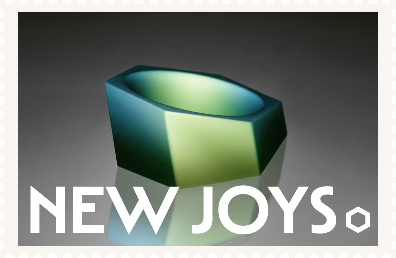
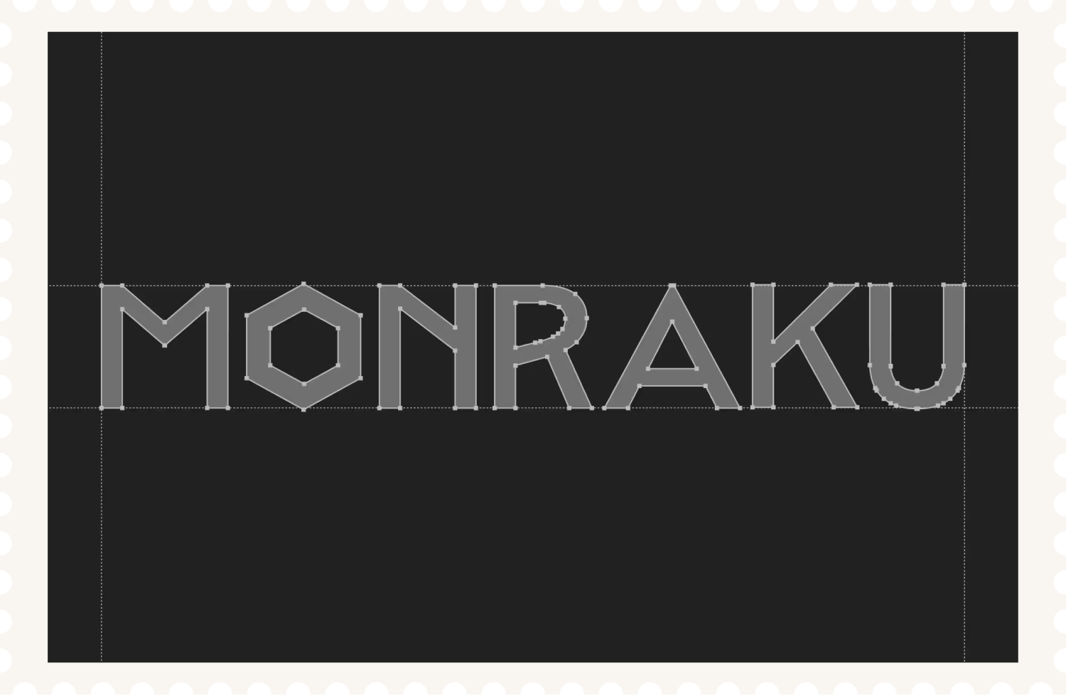
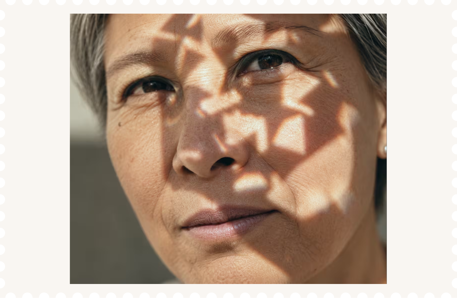
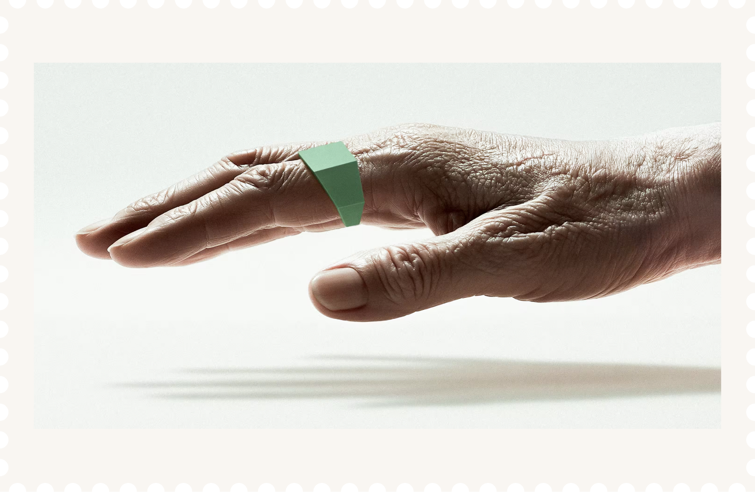
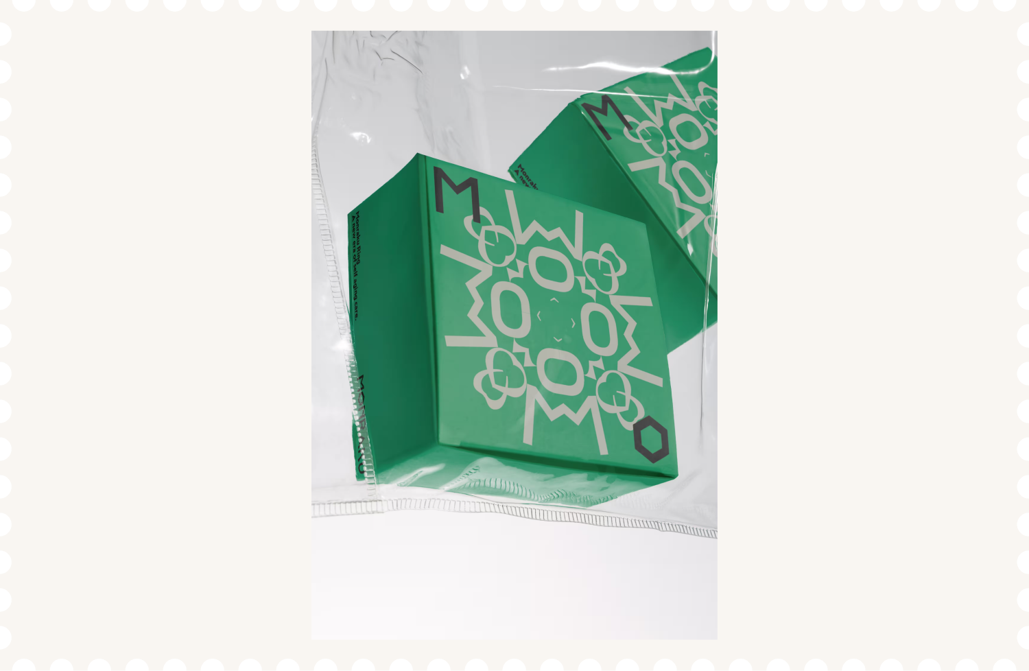
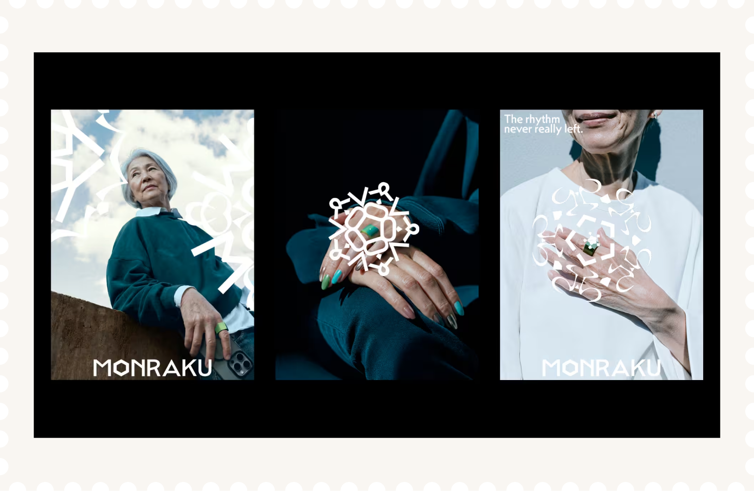
Monraku is a brand identity for an AI ring that helps older adults return to old hobbies, try something new and reconnect with people. Designed as a personal companion they can take anywhere, it encourages them to get out, follow their interests and feel like themselves again. The name plays on dorakumono, a Japanese old slang of indulging in leisure. Here, being absorbed in what you love becomes something to celebrate in later life. The ring takes its shape from diagonally cut bamboo, with a reference to The Tale of the Bamboo Cutter and the idea of a new beginning.The design centres on energy. The greens come from young leaves and new shoots, chosen to give the brand a lively feel and move away from the muted colours often used for older audiences. Mendel Sans adds a sharp, angular feel that complements the ring. The generative kaleidoscope patterns keep turning and changing shape, reflecting life’s capacity for change and encouraging people to find fresh enjoyment in everyday life.
Sector
Health&Tech
Discipline
Brand Identity
Packaging Design
Collaborators
Yue Hu

Next Project
Sushi Mishima
Logo design for pioneering chef breaking boundaries of sushi culture.
Monraku
Conceptual Japanese brand identity and AI ring for post-COVID senior care.


Pick up what you love. Again.
Find more reasons to
step outside.
Share what makes you,
you.
Move more.
Enjoy more.
Make room for new
connections.
Discover what’s next for you.
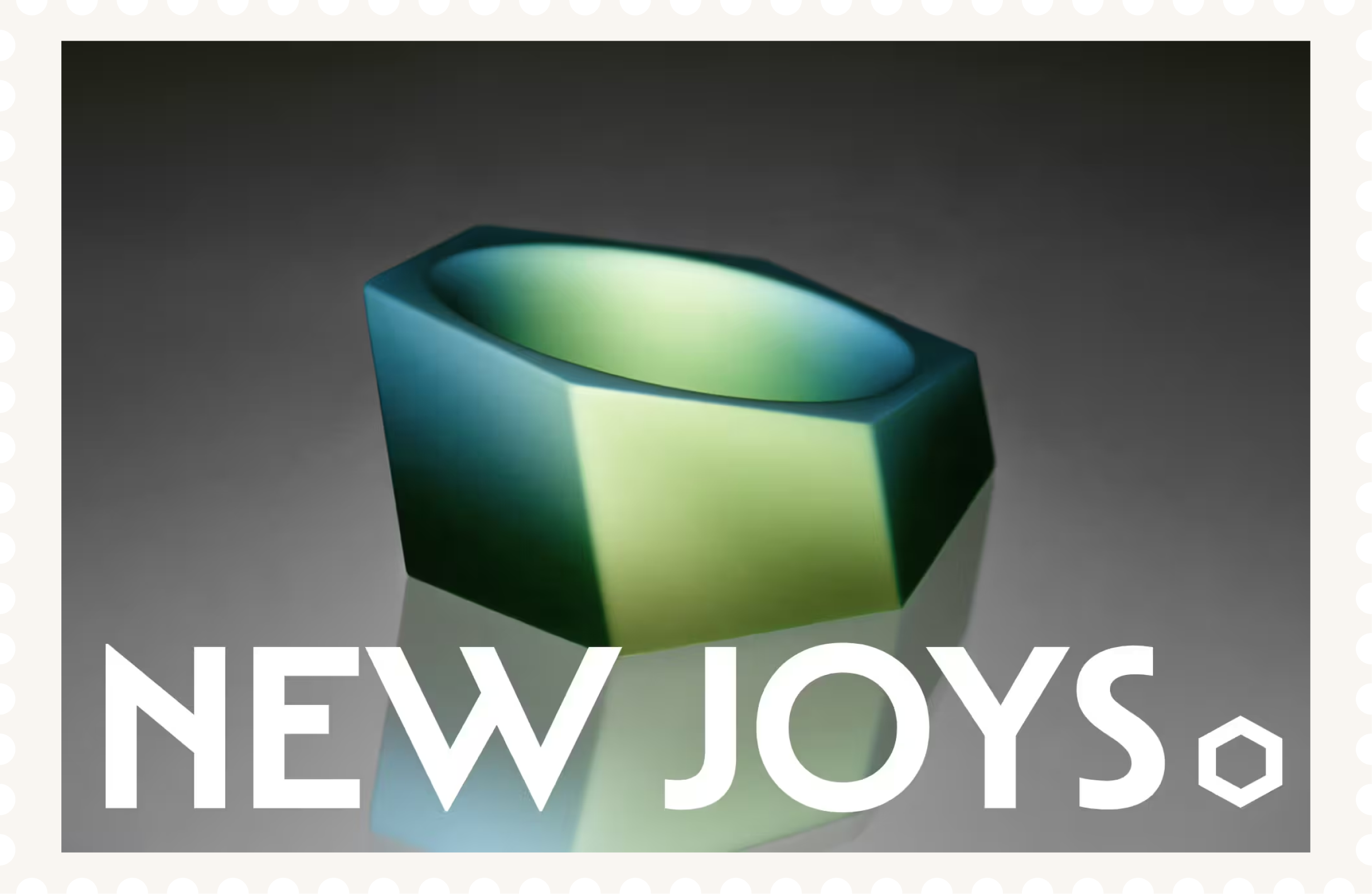
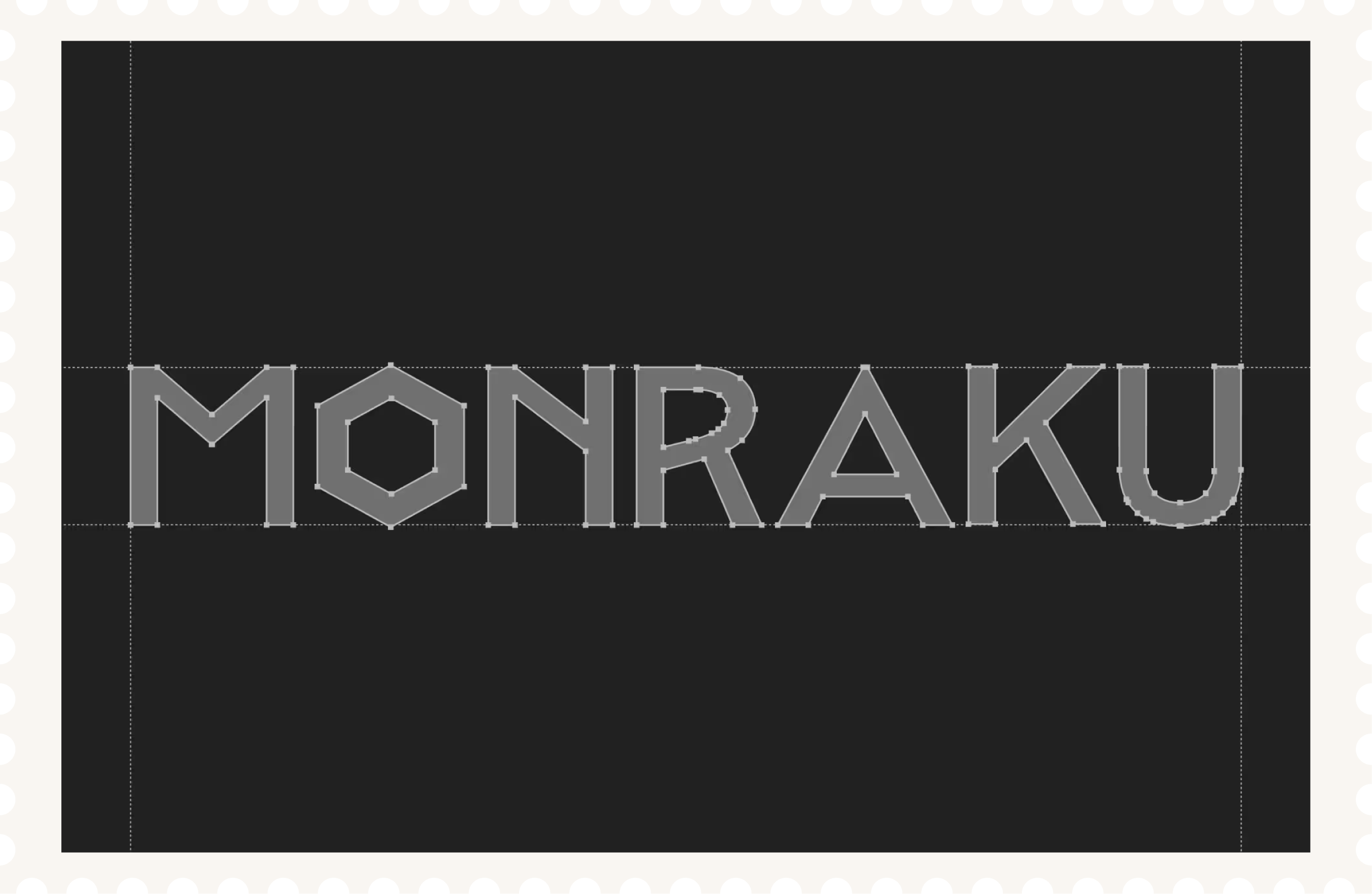
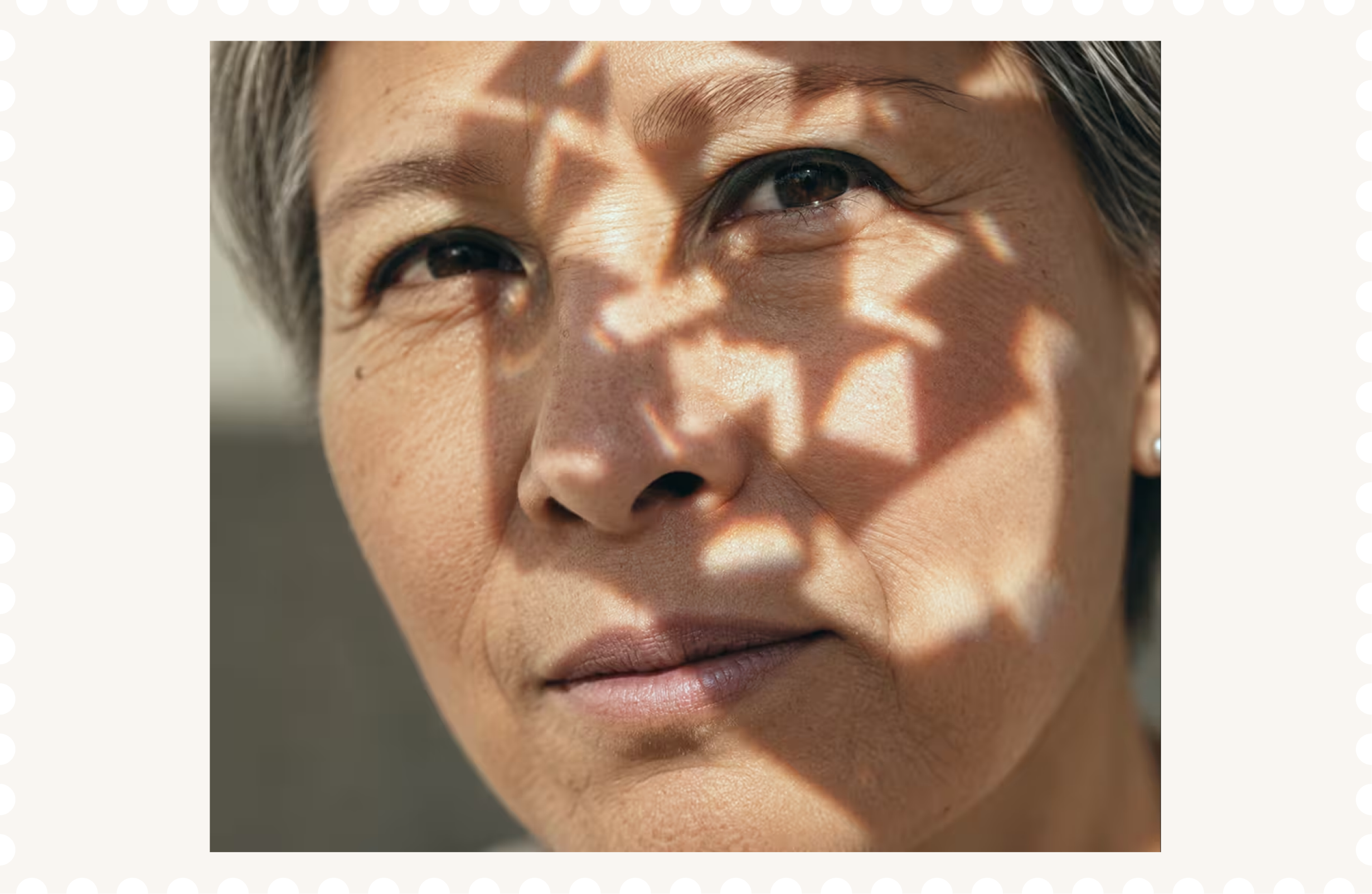
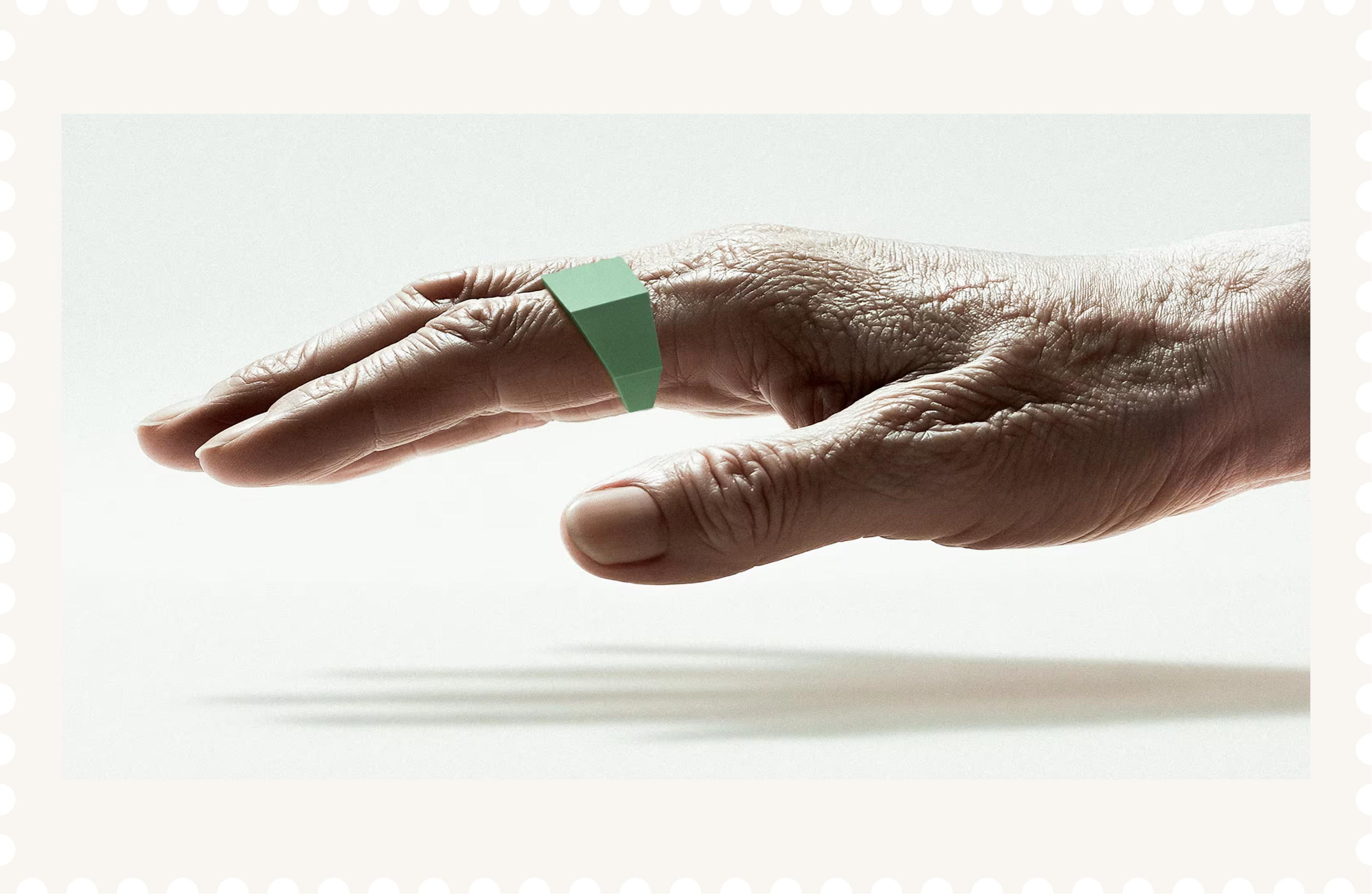
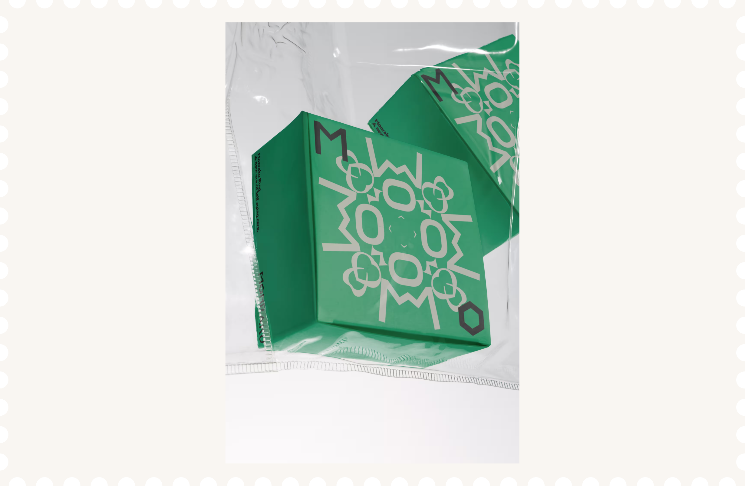
Monraku is a brand identity for an AI ring that helps older adults return to old hobbies, try something new and reconnect with people. Designed as a personal companion they can take anywhere, it encourages them to get out, follow their interests and feel like themselves again. The name plays on dorakumono, a Japanese old slang of indulging in leisure. Here, being absorbed in what you love becomes something to celebrate in later life. The ring takes its shape from diagonally cut bamboo, with a reference to The Tale of the Bamboo Cutter and the idea of a new beginning.The design centres on energy. The greens come from young leaves and new shoots, chosen to give the brand a lively feel and move away from the muted colours often used for older audiences. Mendel Sans adds a sharp, angular feel that complements the ring. The generative kaleidoscope patterns keep turning and changing shape, reflecting life’s capacity for change and encouraging people to find fresh enjoyment in everyday life.
Sector
Health&Tech
Discipline
Brand Identity
Packaging Design
Collaborators
Yue Hu

Next Project
Sushi Mishima
Logo design for pioneering chef breaking boundaries of sushi culture.

Contact
miutokunaga.design@gmail.com

About
Miu Tokunaga is a London-based designer examining fluid boundaries between visual systems, AI creative technology, and tactile culture.Embracing generative intelligence as a co-creative partner, they harness speculative intellect to push creative boundaries and introduce a rigorous neutrality to high-concept tech, luxury landscapes and street culture.
Download
CV