Sushi Mishima
Logo design for pioneering chef breaking boundaries of sushi culture.


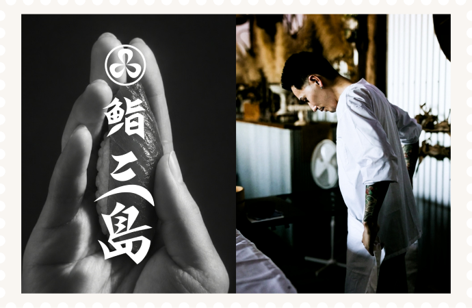
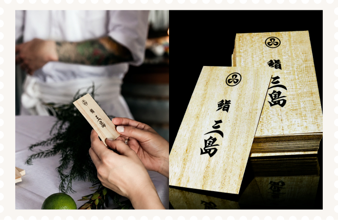
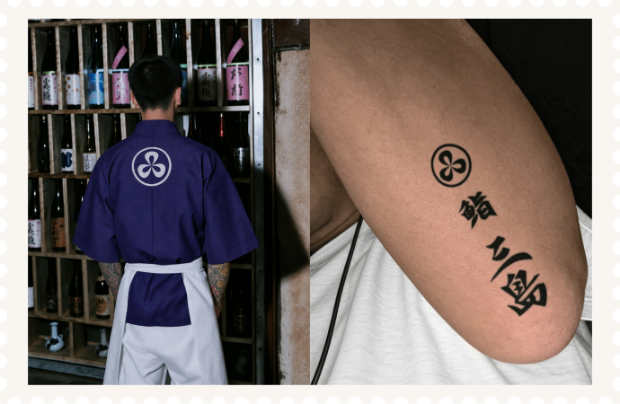
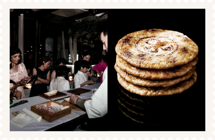
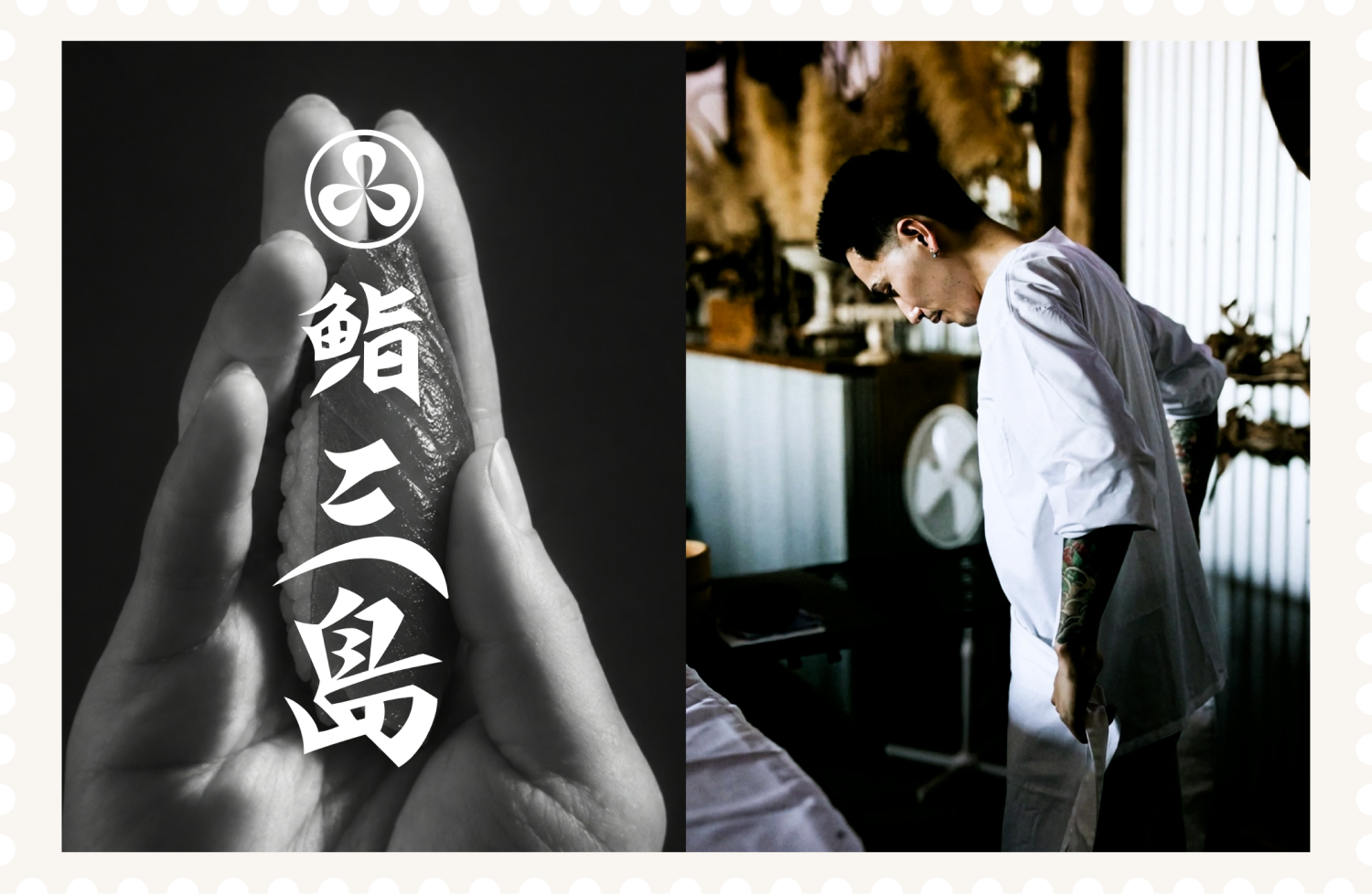
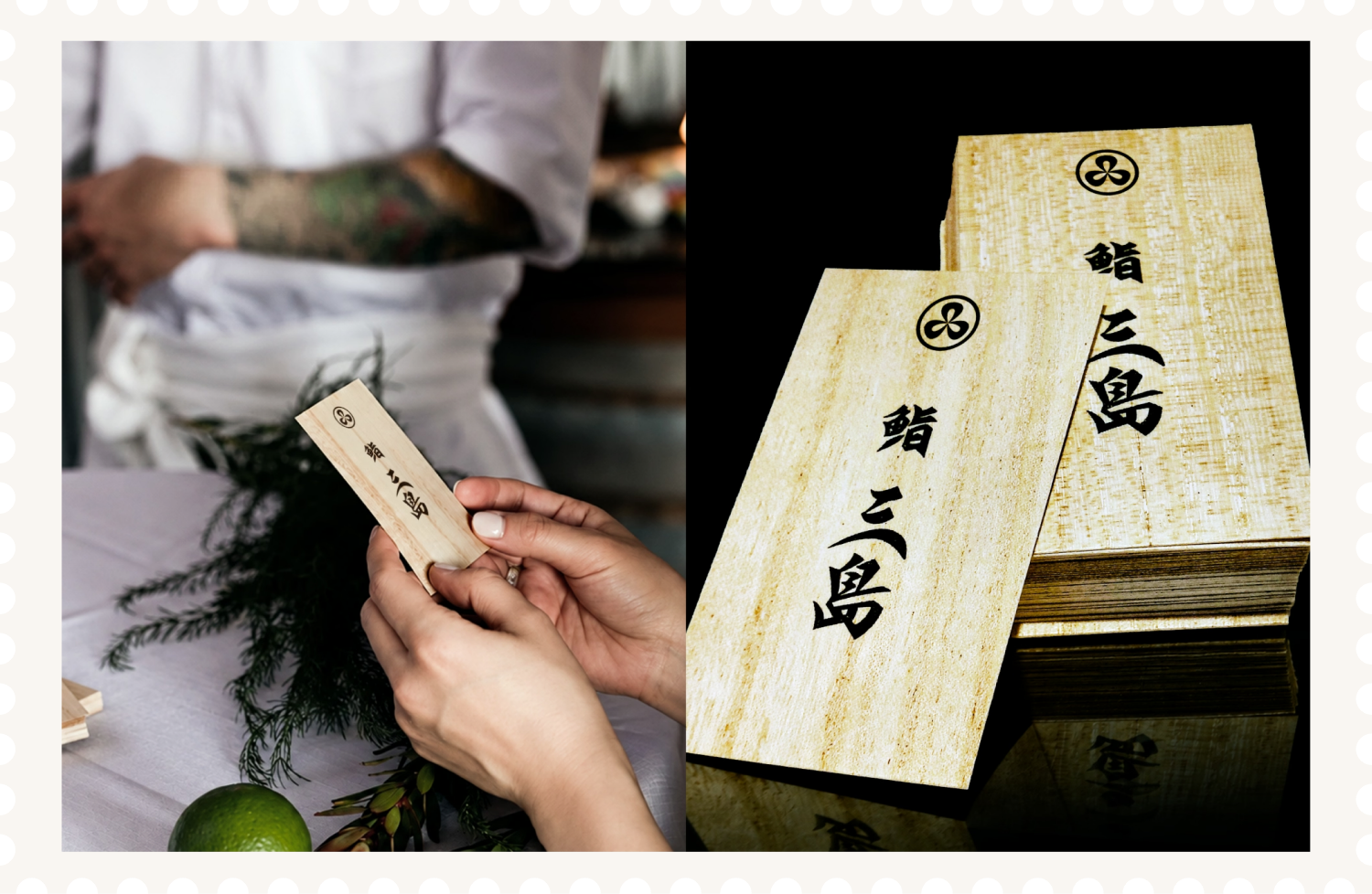
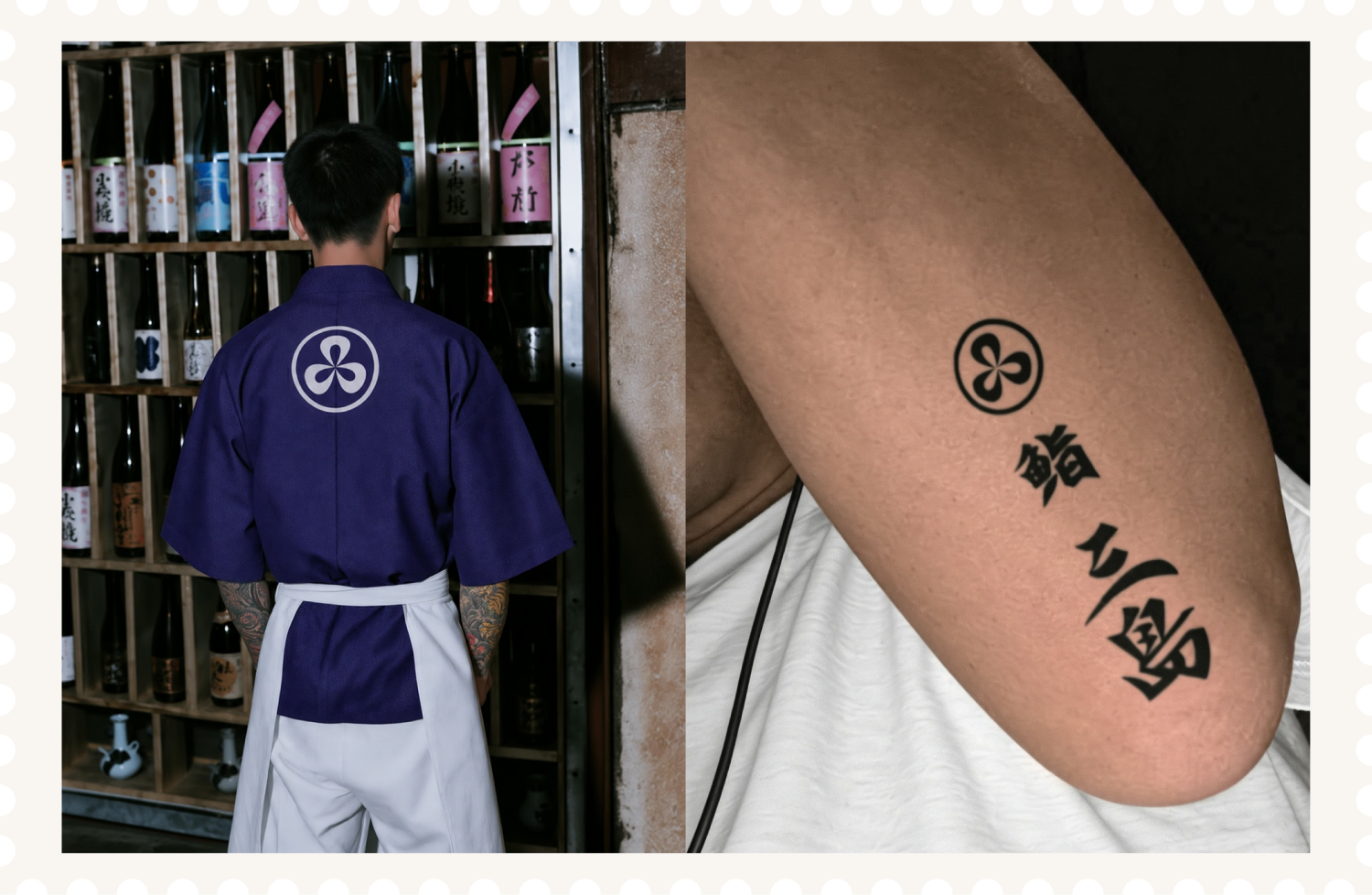
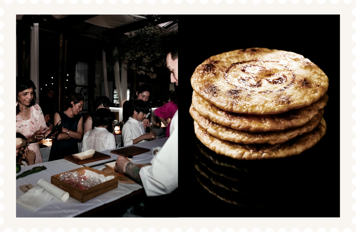
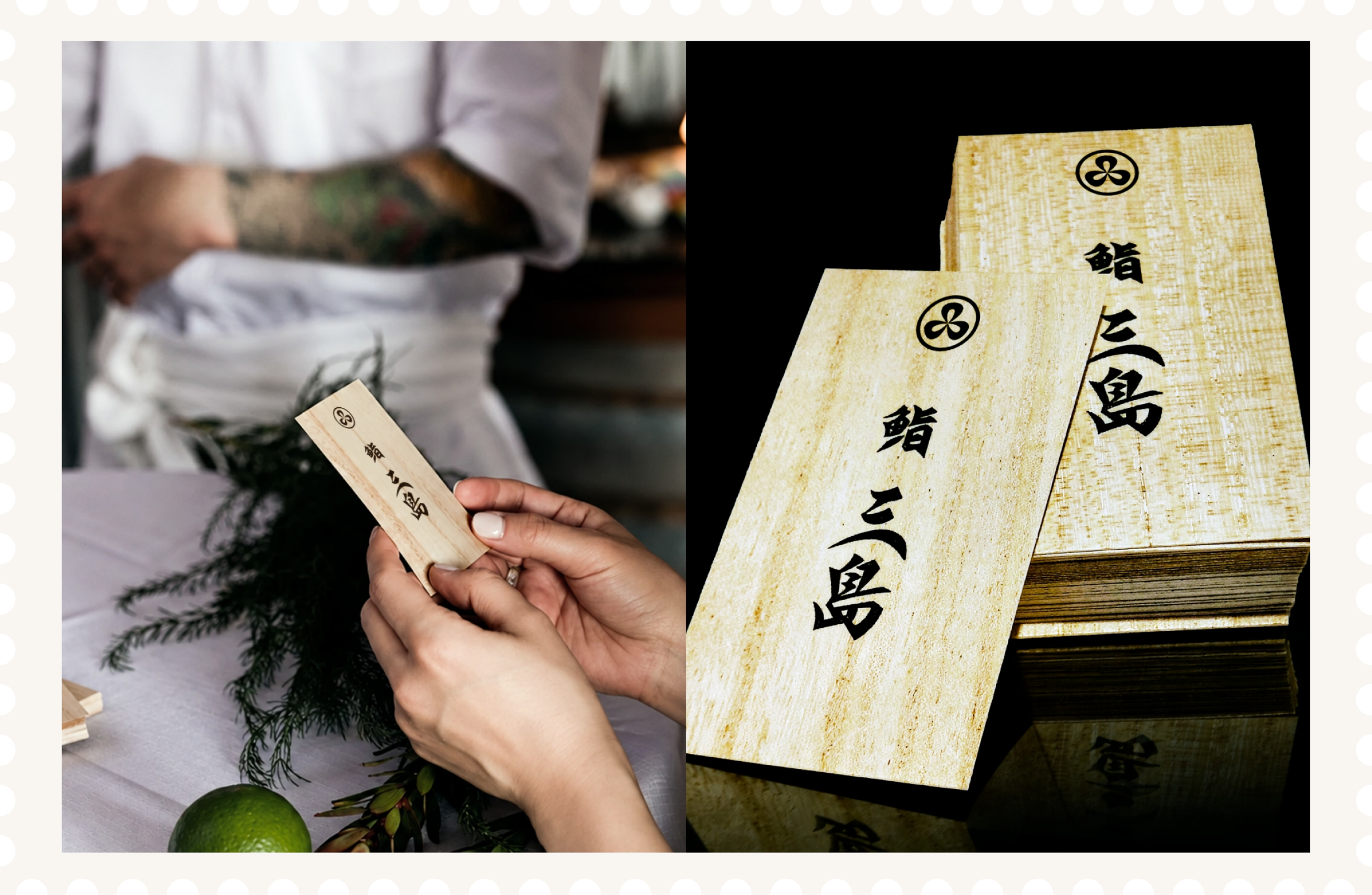
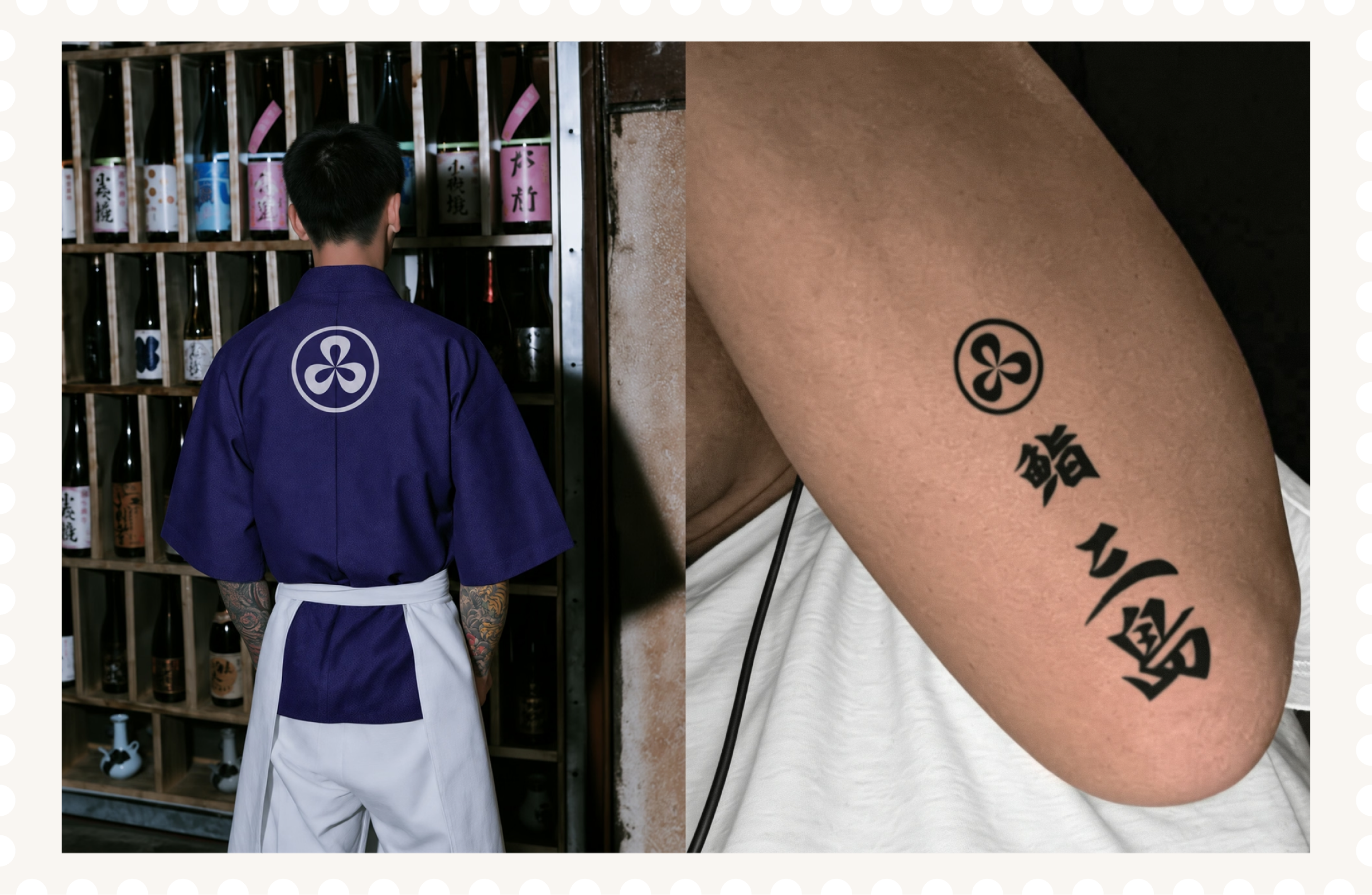
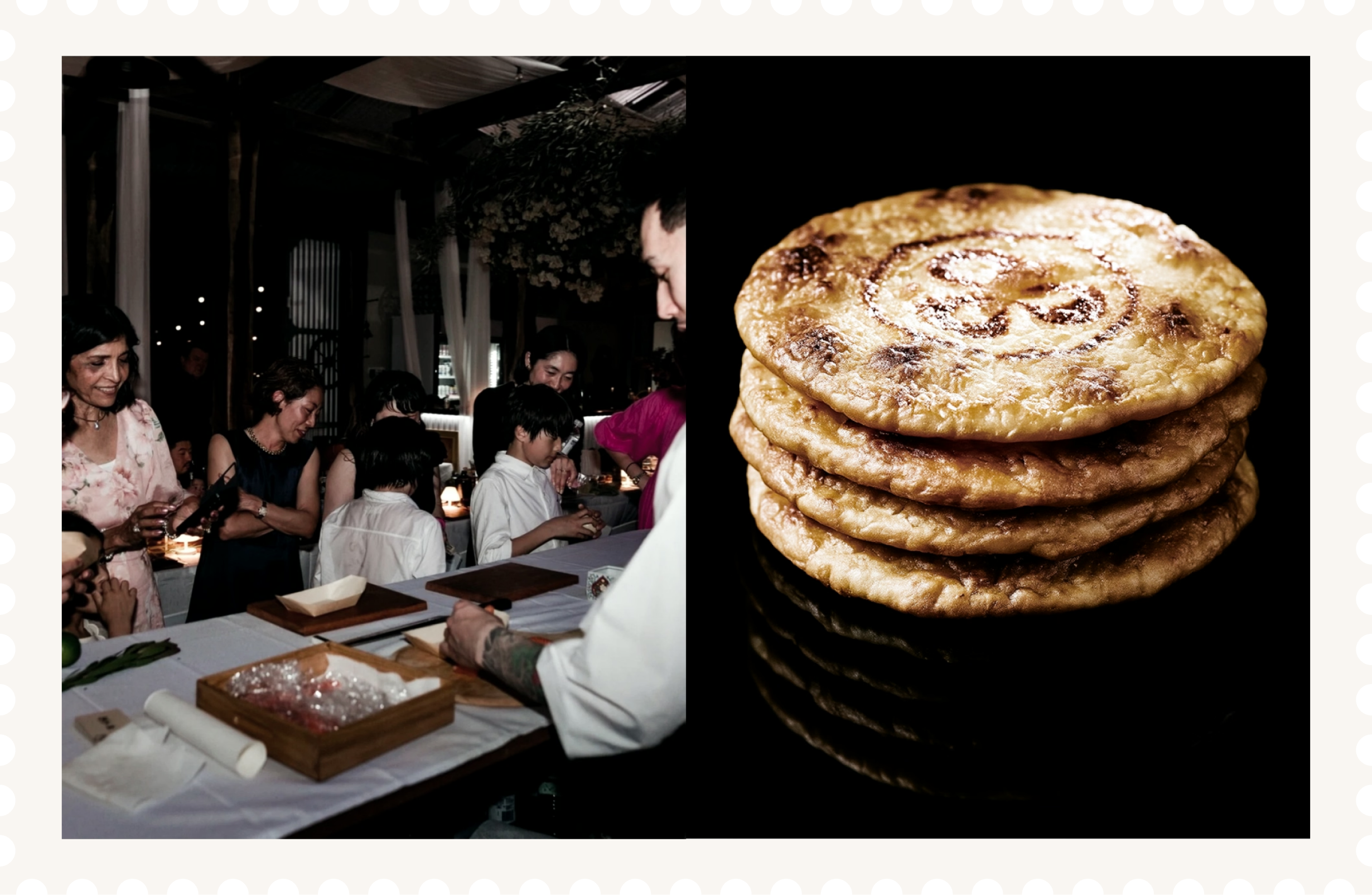
Sushi Mishima is a sushi catering brand run by a tattooed Japanese chef. This logo was made to reflect the man, the sushi he makes, and his approach to sushi, using a less conventional style than traditional Japanese lettering.
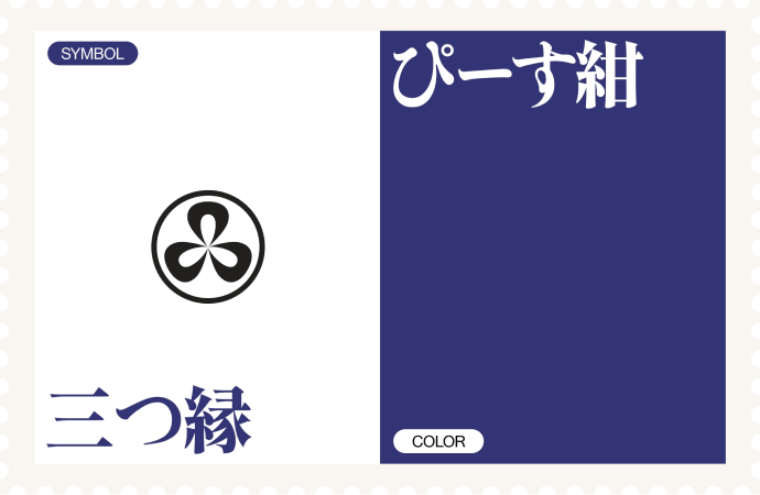
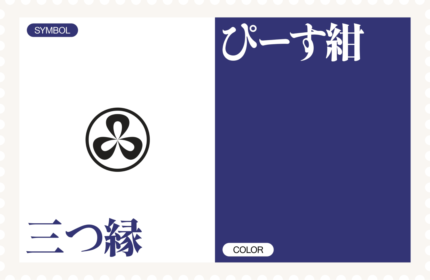
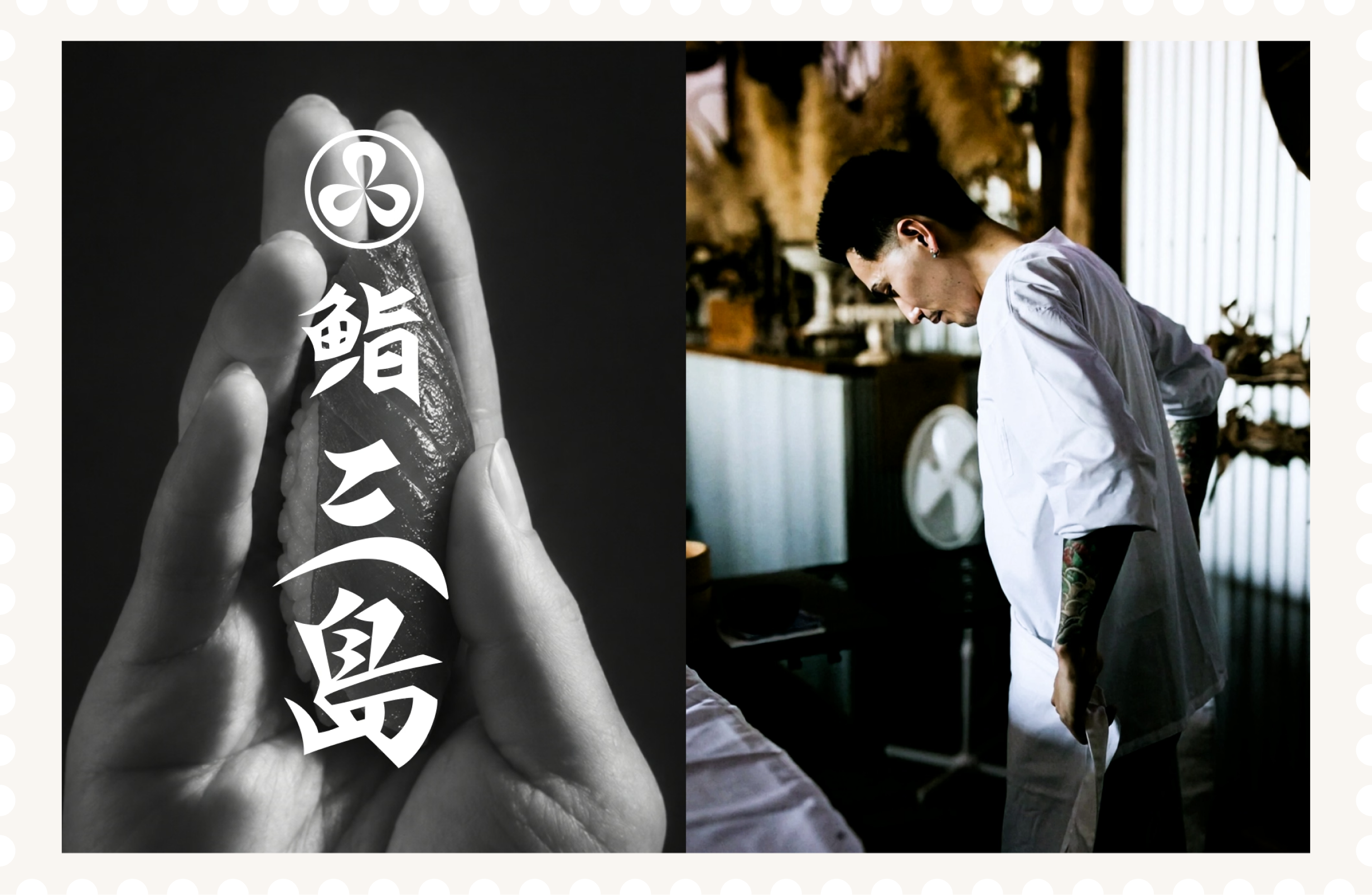
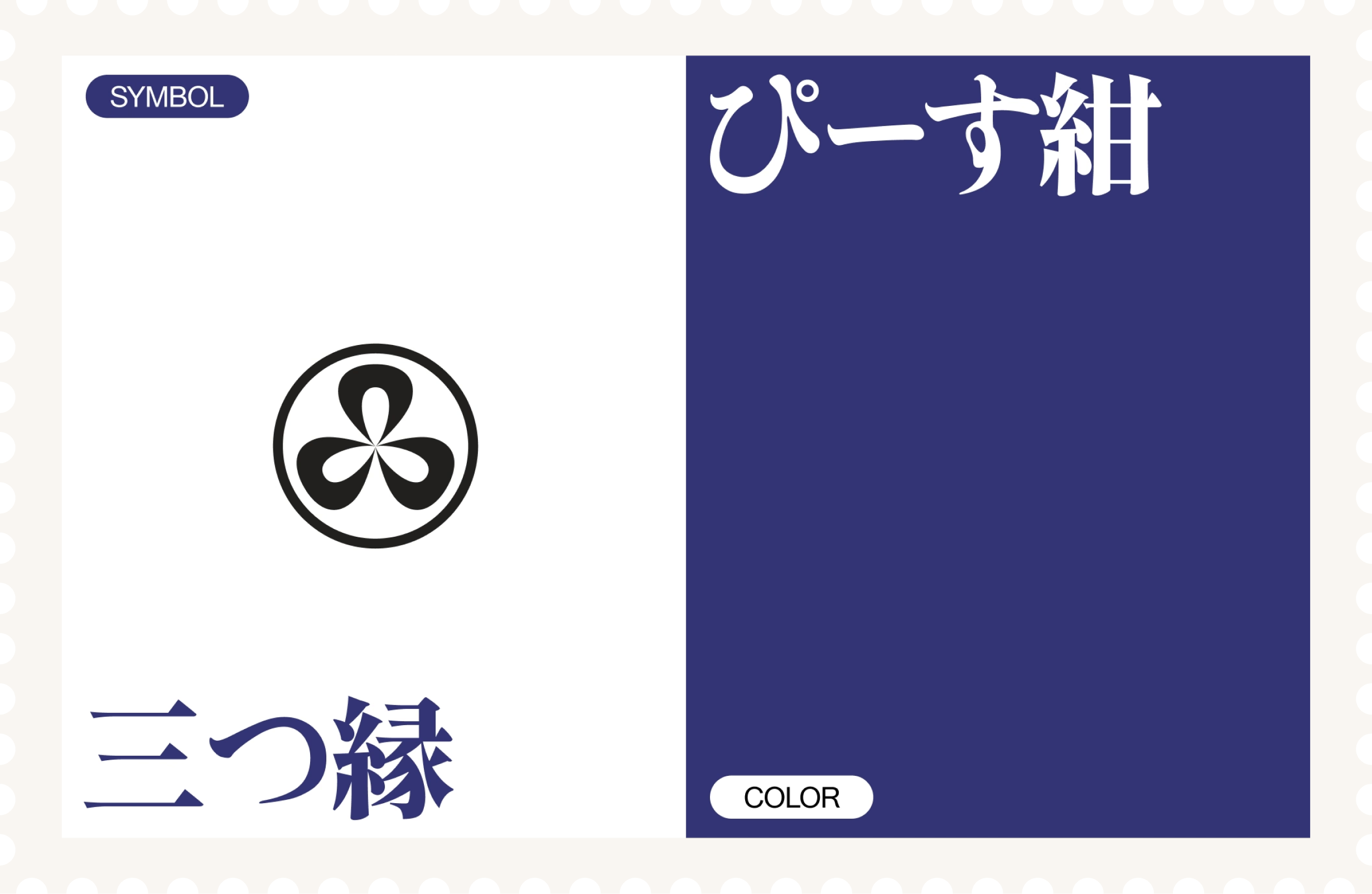
This hand drawn typography is inspired by the typography found in yakuza films of the 1980s, and is rendered in bold brush strokes and humor, typically found in this genre of film. The letter forms are calligraphic in nature with sharp edges, contrast and movement of a blade. The brand colour is inspired by the packaging of Peace cigarettes, a brand said to have been favoured by Yukio Mishima, whose name also informed the Sushi Mishima brand.
Client
Hikaru Fujita
Sector
Food
Discipline
Brand Identity
Logo Design

Sushi Mishima
Logo design for pioneering chef breaking boundaries of sushi culture.

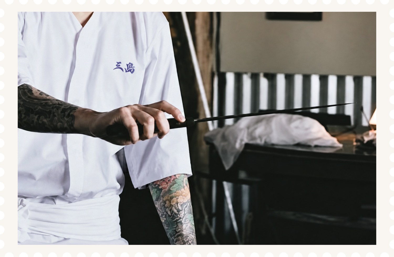
Sushi Mishima is a sushi catering brand run by a tattooed Japanese chef. This logo was made to reflect the man, the sushi he makes, and his approach to sushi, using a less conventional style than traditional Japanese lettering.
This hand drawn typography is inspired by the typography found in yakuza films of the 1980s, and is rendered in bold brush strokes and humor, typically found in this genre of film. The letter forms are calligraphic in nature with sharp edges, contrast and movement of a blade. The brand colour is inspired by the packaging of Peace cigarettes, a brand said to have been favoured by Yukio Mishima, whose name also informed the Sushi Mishima brand.
Client
Hikaru Fujita
Sector
Food
Discipline
Brand Identity
Logo Design

Sushi Mishima
Logo design for pioneering chef breaking boundaries of sushi culture.


Sushi Mishima is a sushi catering brand run by a tattooed Japanese chef. This logo was made to reflect the man, the sushi he makes, and his approach to sushi, using a less conventional style than traditional Japanese lettering.
This hand drawn typography is inspired by the typography found in yakuza films of the 1980s, and is rendered in bold brush strokes and humor, typically found in this genre of film. The letter forms are calligraphic in nature with sharp edges, contrast and movement of a blade. The brand colour is inspired by the packaging of Peace cigarettes, a brand said to have been favoured by Yukio Mishima, whose name also informed the Sushi Mishima brand.
Client
Hikaru Fujita
Sector
Food
Discipline
Brand Identity
Logo Design